


Nigerian Real Estate Development Company, Adron Homes, unveils new logo
While Adron Homes says the rebrand is its way of staying ahead of the curve, it has received criticism for the new logo, with some calling it unprofessional and a downgrade from the previous one

Adron Homes, a pan-African real estate development company, has unveiled a new logo to “mark a new chapter in its journey.”
“Exciting News! We are thrilled to unveil our ‘new logo’ at Adron Homes, a symbol of our commitment to embracing the latest trends, innovation, and ideas,” the announcement stated. “Our new logo is more than just a design; it’s a testament to our unwavering promise to exceed expectations. The world is coming to us, and we are ready to welcome it with open arms.”
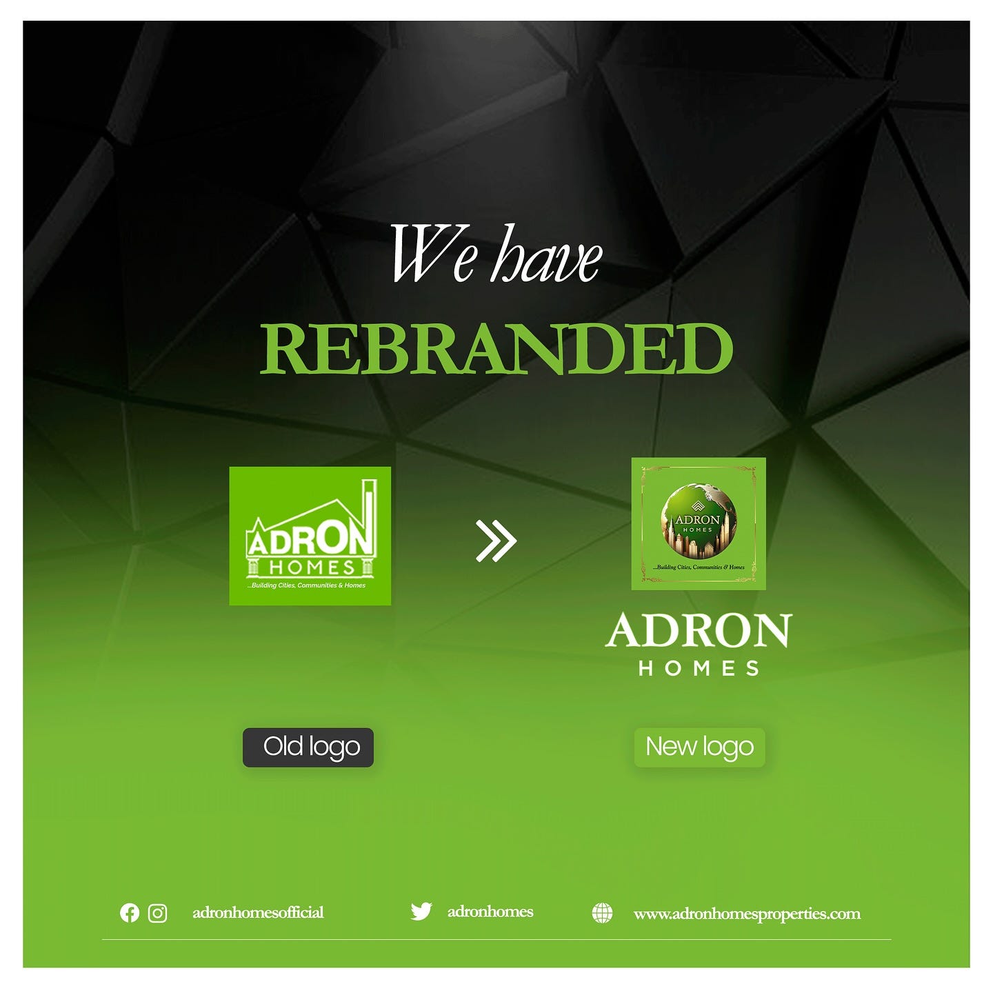
Founded in 2012, Adron Homes set out to empower people to become homeowners by providing incredible and affordable housing. “This rebranding marks a new chapter in our journey, reflecting our dedication to staying ahead of the curve and continuously evolving to meet the needs of our valued clients,” it shared.
Read Also: African Language Learning Startup, TopSet rebrands as Lingawa
“The old logo looks way better”
While the company says the rebrand is its way of staying ahead of the curve, it has received criticism for the new logo from many, with some calling it unprofessional and a downgrade from the previous logo. “This is rather hard to read. All your logos before this were easy to identify from afar without straining the eyes, if it’s not broken don’t fix it,” says one comment.
“The old logo looks way way better. The new logo looks like a logo one old man designed in the year 1800. The old logo is far more better,” another shared.
Many comments noted that the new logo is not as memorable and recognisable as the previous one. “I think the old logo is more realistic and unique,” says one comment. “2023 looks more professional and readable,” says another comment.
“The old logo is better, there [are] a lot of things to be considered when rebranding, it feels more like some brands are only rebranding because other brands did theirs,” Yussuph Luqman, a Graphic Designer, commented on the announcement post. He added, “The old logo stands out, it's easy to recognize, maintains readability when scaled down, simple and more importantly communicates the brand more. For the new logo trust me it's not speaking modern rebrand, nothing unique, looks a bit unprofessional (for me), lacks readability and I'm sure it can't be recognized like the old logo on a small medium but in all not much of a rebrand.”
Read Also:

One common concern raised about the new logo is it scalability, that is, ability to remain legible and recognisable in small size. “Nice logo but one of the principles of a good logo is scalability. The New logo is not Scalable. The old one is more commanding and Precise,” one comment shared.
“People are rebranding and going flat with their logos, una dey go more detailed,” one comment pointed out. “Please check what a good logo should be before rebranding. This isn’t timeless and isn’t memorable, not scalable, I can’t recognize the logo at all small scale. In fact, experiment with this, place your logo as the smallest icon on a phone and see whether you still recognize it. That shows a good logo should be recognizable even at small scale without losing details.”
Another noted, “The previous logo was a hit, this new one is a proper miss…..it doesn’t follow any of the logo design principle, not scalable or even functional in all cases, it’s not too late to review. Goodluck.”
A few comments also suggested that the new logo is AI-generated. “The New Logo looks AI generated; hope Chat Gpt was well-paid sha,” one comment joked. “This is [a] total waste of resources. It's like going from frypan to fire. The new logo doesn't reflect anything.. It’s just an ÁÌ generated image,” another shared.
Another comment said, “Sorry but I think brands are moving to minimalist icons but for this, it’s not it. It feels more like ai generated image.”
Beyond the comments under the announcement post of the company, designers on X shared their thoughts on the rebrand.
Check out more stories on African companies that has rebranded/redesigned their identity in recent years.


