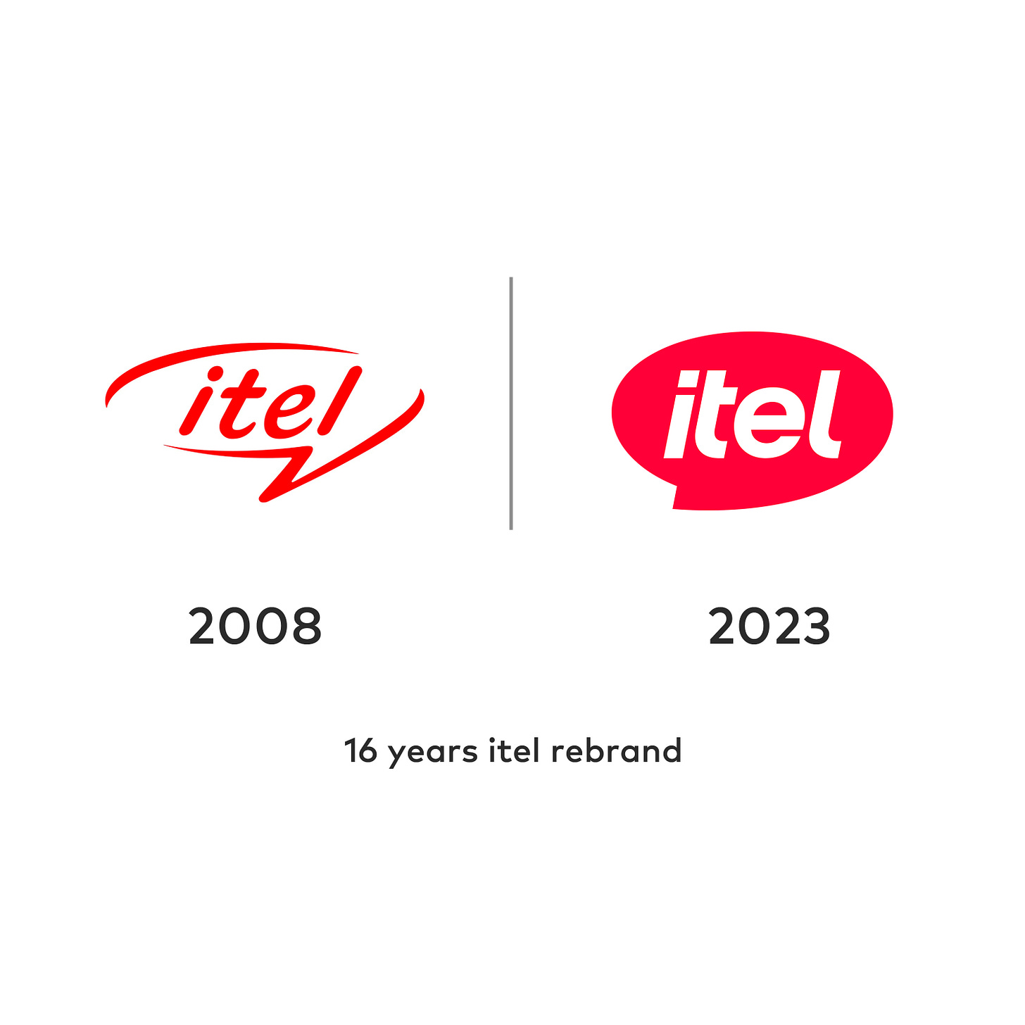
itel, the mobile phone and smart life brand, has a new look that has got people talking
Designed by DesignStudio, the global design team based in Australia, the new look—which has got people talking—is itel's attempt at rewriting the playbook on which means to live the smart life.
itel, one of Nigeria’s leading mobile phone and consumer electronic products companies, has announced a new look—logo and brand identity—as it set out to “rewrite the playbook on which means to live the smart life.”
Established 16 years ago, the Chinese-owned company—known for its affordable phones—is present in more than 50 emerging markets globally.
The company remarked that this rebranding initiative and evolution marks a significant turning point in the brand’s history, introducing a fresh, modern outlook while staying true to its core mission.
According to the company, the revamped logo, designed by DesignStudio, the global design team based in Australia, symbolises a youthful, energetic, and forward-looking approach.
It stated, “This change overturns the solidified perception of the old logo, although the iconic speech bubble retains, symbolising the brand’s commitment to communication and connectivity. The vibrant magenta hue in the new logo evokes a positive and youthful vibe. The consistent forward slanted angle throughout the logo symbolises itel’s future focus to empower and support communities through its products and services it offers.”
The company revealed that it is evolving from a mobile phone brand into a comprehensive "smart life" brand. “Now, itel is offering a diverse range of products that includes smartphones, accessories, personal care products, and home appliances, aiming to provide eco-system service help customers in emerging markets engage in a better life,” the company noted.
While Itel Global has revealed this rebrand since December 1st, itel Nigeria, the Nigeria arm of the company, announced the rebrand 11 days later—on December 12th, following its rollout campaign.
In November, itel Nigeria, in a now-deleted social media post, announced the “itel revamp challenge”; a logo design challenge for designers to reimagine the now-old itel logo, for a chance to win “an itel powerbank and other gift items”. The company quickly retracted the challenge following a backlash from the design community as the challenge and attached prize is said to be demeaning and insulting to the creative and design community.
Reactions following the rebrand announcement
The rebrand announcement has been met with both praises and backlashes. “Sack whoever came up with the rebrand idea. Not a fan of itel products but this old logo is sleek. The old feels like the new. The rebrand is a bad idea,” wrote a social media user. Another one wrote, “The old sorta feels like the new…literally looks better in my opinion…but if it better represents the brand, that’s all that counts. Congratulations on the relaunch.”
“Here's hoping the designer/s got paid with more than a powerbank,” another wrote sarcastically. “Not a bad logo redesign but you don’t deserve respect/applause since you disrespected creatives,” said another comment.
Read Also: Opay reveals new logo and declares the dawn of a new era
A customer who seems to be less interested in the rebrand itself but impressed by the improvement in the new versions of itel’s product wrote; “Well I really don't care about the logo ..... Itel phones are rapidly improving .... Thumbs up. itel .... Am using P40 and is very cool.”
Victor Fa, brand consultant and designer, wrote; “The quotes prove that if people don’t like you, everything you do won’t look good to them. They won’t even do it intentionally. It just honestly won’t look good to them. I don’t like them too but objectively, that new logo is cool, clearly better typography and composition, also more compact and ‘solid’.”
Another comment noted; “The new one would have been perfect if it was a telecom brand/company.”
The rebrand has again sparked a conversation on how people react to big brands changing their identity (logo) especially after the previous one has been in use for a long time.
Check out the social media announcement by itel Nigeria for more reactions to the new logo and identity.


