Nigerian Banking-as-a-Service company, Anchor, unveils refreshed identity to harmonise its visual identity across all its brand touchpoints
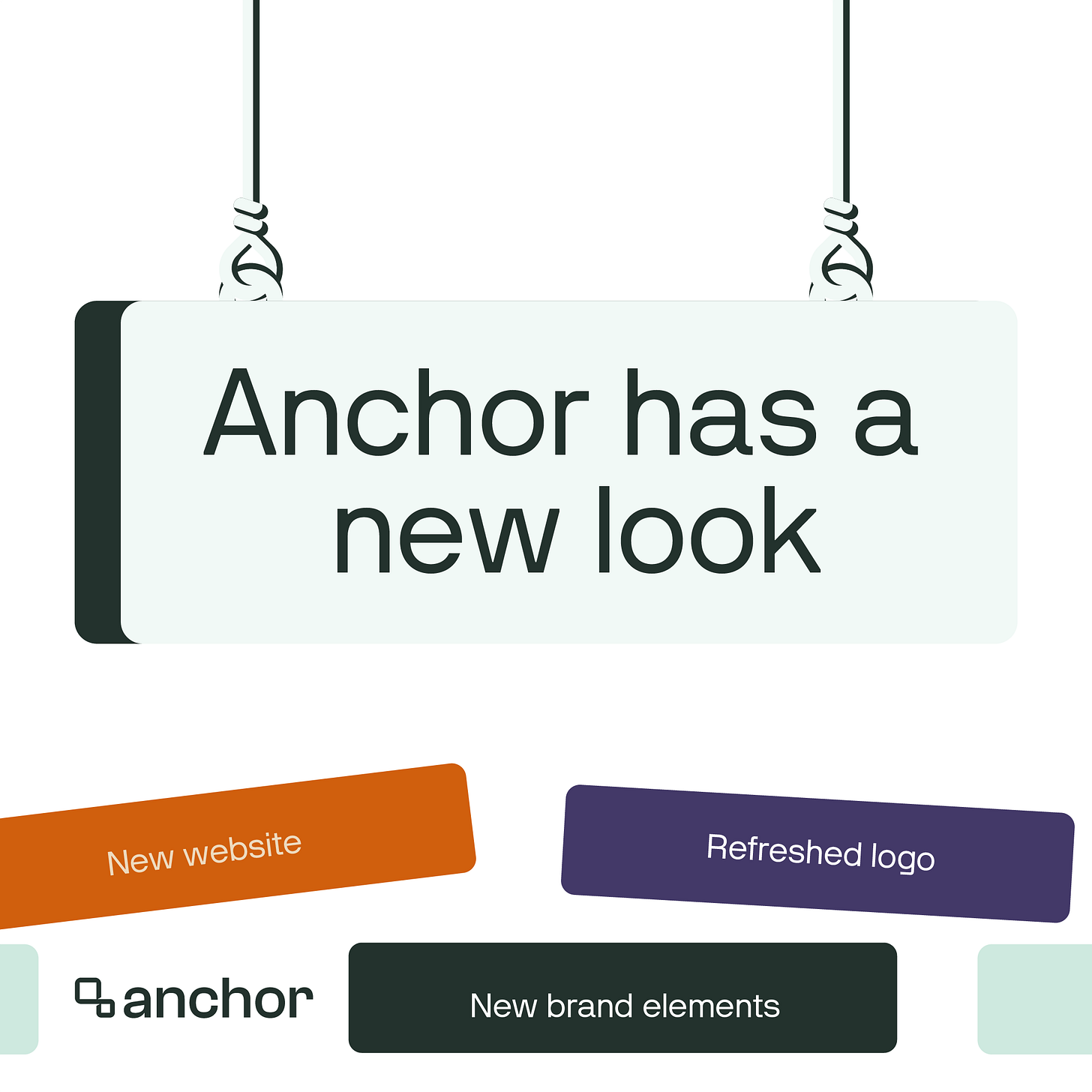
For this brand refresh, the company retained its existing logo mark but introduced new colours, bold typefaces, and a new, sleek, and user-centric website—made by CheckDC, a Nigerian-led design agency
On Monday, January 8, 2024, Nigerian Banking-as-a-Service company, Anchor, unveiled a refreshed identity—a new typeface, colour system, and website—in a move to harmonise its visual identity across all its brand touchpoints.
In September, the YC-Backed startup announced it raised $2.4 million seed to expand its product offerings. It also recently launched its Bills Payments API which allows businesses to offer data and airtime purchases, cable subscriptions, and electricity payments.
“The rebranding at Anchor goes beyond the colour scheme and website, it's about redefining our commitment to innovation, trust, and customer satisfaction,” said Anchor's CEO and Co-Founder, Segun Adeyemi, highlighting the company's commitment to offering innovative, customer-focused services.
For this brand refresh, the company retained its existing logo mark but introduced new colours, bold typefaces, and a new, sleek, and user-centric website—made by CheckDC, a Nigerian-led design agency.
Ibrahim Otukoya, brand designer at Anchor, told The Creatives Note that the brand refresh was done to harmonise Anchor’s visual identity across all brand touchpoints. “We noticed a disconnect in the visual representation of Anchor across different brand touchpoints. For example, the website was designed with the brand’s primary colour (orange) while the social media designs made use of the brand’s secondary colours (blue and black). So the two didn’t feel like they belonged to the same brand. They felt disconnected,” said Ibrahim, speaking with The Creatives Note on why the team embarked on the brand refresh.
Read Also: Nigerian fintech startup, Grey announces a brand refresh—new logo and website—as it set to expand into new markets and take it operations global
“When I joined the company in February, I was asked to look into and do something about this visual disconnect happening. The first thing I did was try to harmonise the colours but eventually, the conversation ended in us needing to do a visual refresh,” said Ibrahim, who led the brand refresh effort by the company. “I started working on the refresh in March and by May, we had something tangible.”
“For the refresh, I went for new typefaces and developed a new colour palette. For the colour, I decided to move away from blue—the colour synonymous with fintech companies.”
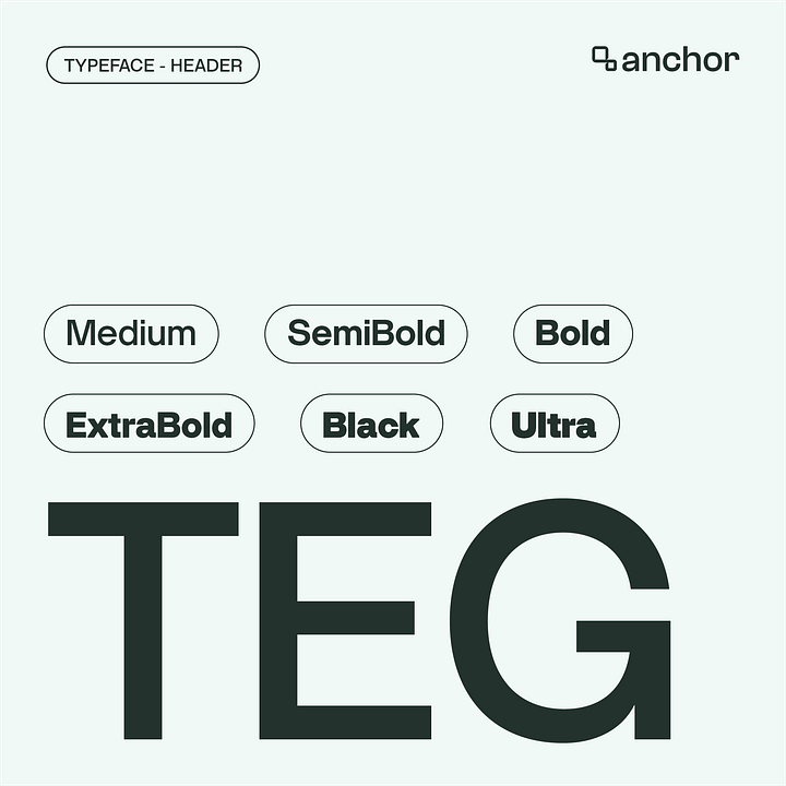


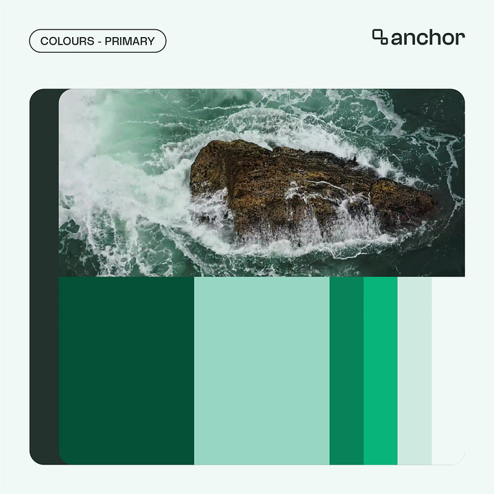
Once the decision on the new visual direction was made, the Anchor team brought on CheckDC to work with them on the website. “We had to bring on an external team to work with us on the website because everyone on the team was working on various projects—as a startup in the growth stage, we have a lot of moving parts and ongoing projects—and we needed to extend the refreshed visual identity to our website to be able to launch it,” he shared. “We brought on CheckDC to work with us on the website and they did a great job with that.”
“There was a lot of back and forth before we arrived at what we have now. It was a lot of work but we are happy with the result,” he added.
Further speaking on the result of the brand refresh exercise, Ibrahim said, “We now have a cohesive visual image across all brand touchpoints. Our social media pages, website, newsletter, and other brand assets now feel harmonious and like they belong to the same brand.”
This move sees Anchor join the growing list of African startups that have undergone a brand refresh/redesign in recent months.


