Nigerian HRTech company, Pade, unveils new identity to reinforce its commitment to African workers and employers
Designed by Void Studios—led by Joshua Biyere and Chief Osaretin Avbuluimen—the new identity is built on the company’s value: GETs Fulfilled. [G–Growth, E–Empowerment, T–Trust, S–Simplicity].
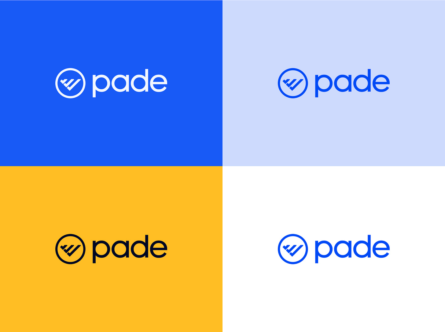
Pade, a Nigerian HRTech company, has unveiled a new identity—a refreshed logo, typeface, and colour system—a reinforcement of its “commitment to creating a fulfilling experience for African workers and employers.”
Pade was cofounded by Seye Bandele—a former marketing lead at Yudala and Konga, and Lekan Omotosho—a former consultant to Nigerian state governments and the FCT in 2020. Since launching in 2021, Pade has disbursed ₦24.485 billion in salaries for its clients like Flutterwave, TSL, and Dantata—with ₦11.473 billion of the payout made in 2023.
“Before we launched, I didn’t put too much thought into our visual identity, I figured we’ll cross that bridge when we got there. Lekan just continued to write code for months and months while I focused on market surveys and customer interviews,” Seye Bandele, CEO of Pade, wrote in a post on social media.
“About 3 weeks to kickoff, I hurriedly sketched our former identity on a piece of paper and sent it to Tare-Joshua to design. He sent it back in a few hours and we ran with it.”
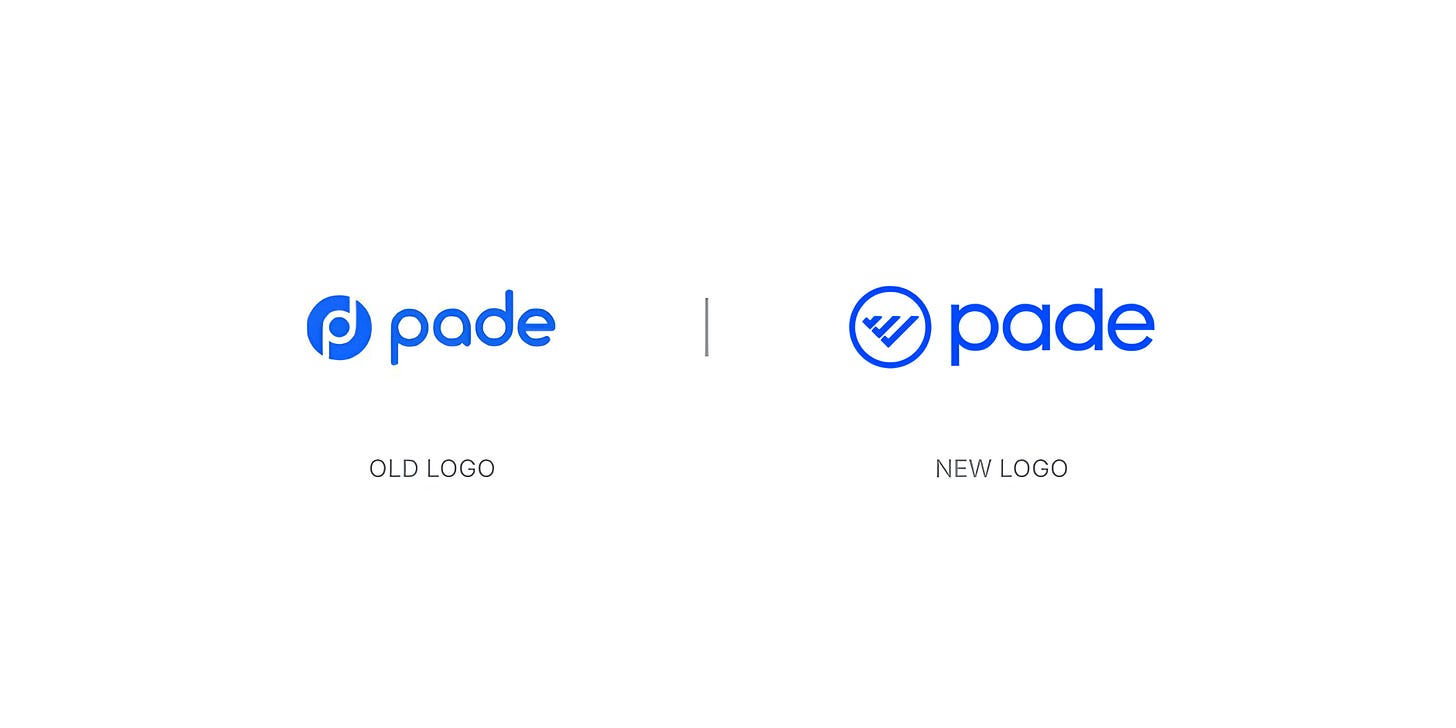
“The feedback on our previous brand was interesting, some said it looks like Beats by Dre, others said it was just plain ugly. Bottom line, our identity just did not connect with what our company had now morphed into,” Seye revealed.
While Pade started as a people automation software, it has evolved into a platform that is fully embedded in the people operations of change-making organisations. “Like a ship entering uncharted waters, we realised that it was time to expand our horizons and launch a new identity that is representative of the role we play in the operations of our customers and the HR ecosystem at large,” the company wrote in its announcement.
“To reinforce our commitment to you, we refreshed our brand elements across the board to reflect one thing when you interact with us; Our mission to make work simpler so that the lives of African workers can be improved.”
Designed by Void Studios—led by Joshua Biyere and Chief Osaretin Avbuluimen—the new identity is built on the company’s value: GETs Fulfilled. [G–Growth, E–Empowerment, T–Trust, S–Simplicity].
“The checkmarks represent quality assurance and efficiency that Pade brings to your HR and payroll processes,” the announcement noted, explaining the meaning behind the new logo. “When you reorient the checkmarks, it becomes a growth chart that signifies our emphasis on personal, professional, and organisational growth.”
“Finally, the circle represents the world of work (including you and every other African business and employee).”

“With this rebrand, we are entering into a new phase of our growth, both product-wise and in the HR ecosystem. We have a couple of plans lined up that we are bursting at the seams to share with you.”
Check out other African companies that have undergone a brand refresh/redesign in recent months.


