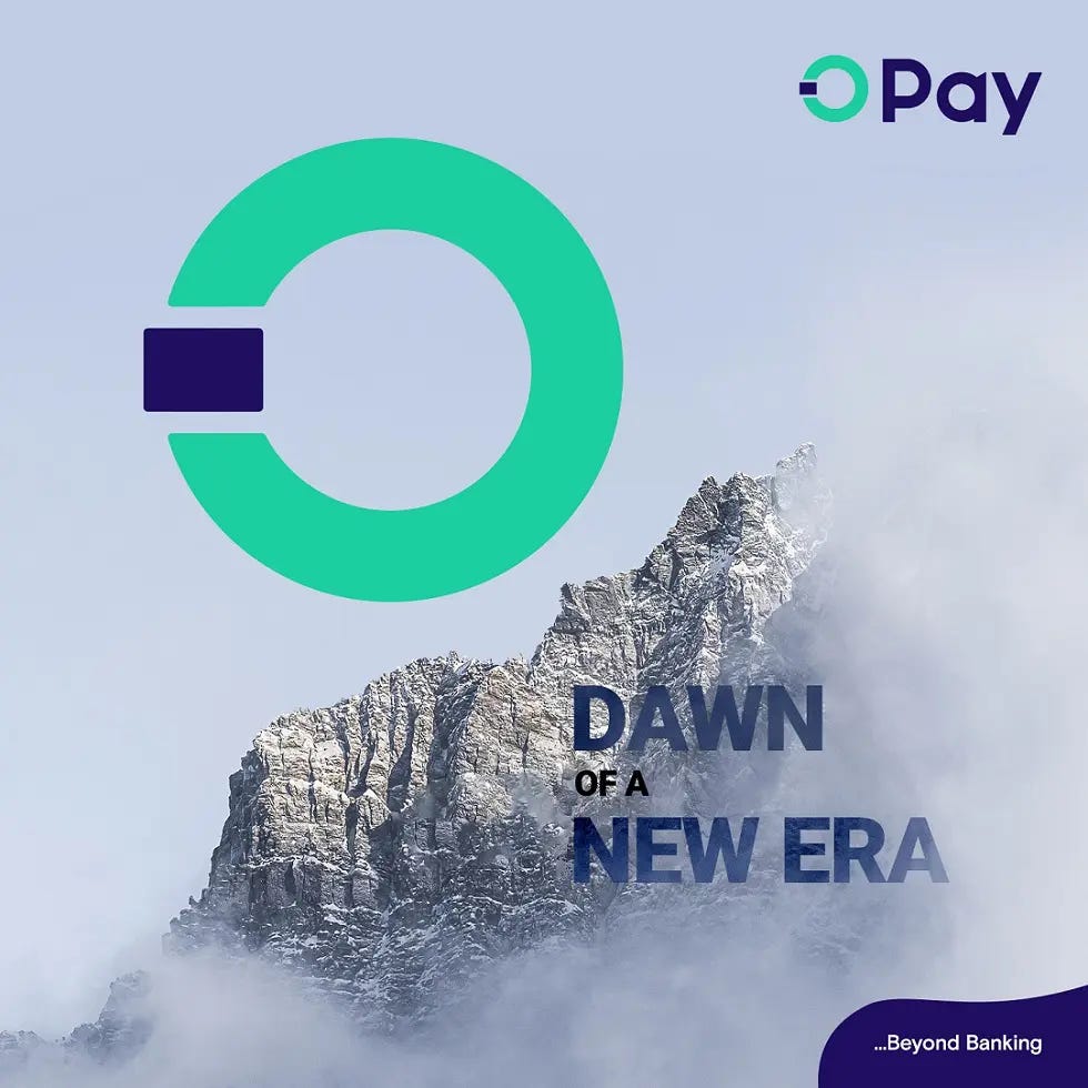
Opay reveals new logo and declares the dawn of a new era
To mark its 5-year anniversary... this new brand identity is expected to consolidate its position as the most prominent last-mile payment service provider in Nigeria for both consumers and businesses
On the 26th of July 2023, Opay Nigeria, one of Nigeria’s leading financial service companies, revealed a new logo across their social media handles and welcomed their customers to a new Era. In a brand press, the company stated that the new logo is meant to “mark its 5-year anniversary in the Nigerian market.”
Writing about what the new logo represents, the company wrote, “‘O’ represents a loop that signifies OPay's dedication to continuously providing bespoke and impeccable services as well as its commitment to staying ahead of the curve in the rapidly evolving financial landscape.”
It also added that “Additionally, it incorporates a square element that indicates the newly launched OPay debit card, enabling over 40 million users to link their cards to their wallets, making payments easier. The new logo does not only represent the brand's business attributes but also embodies its commitment to its constant strive for excellence and creating a unified global brand image.”
The company stated that this new brand identity is expected to consolidate its position as the most prominent last-mile payment service provider in Nigeria for both consumers and businesses as it intends to continue leveraging technology to deliver effective and reliable financial solutions to customers and expand its product offerings, enhancing its features, and broadening its market reach.
Reactions following the logo reveal
The reveal has been followed by different reactions. Some of their users/customers are excited about the change while some are not-so-impressed and some are indifferent to the change. In an Instagram comment on the logo reveal post, Instagram user, kcgfxcreativestudio wrote “What a terrible way of unveiling a logo revamp, in this age we are.” Another user, collins_frostwalker wrote, “The mountain ain't really necessary o. It's a banking app not a universal studios movie I think the logo is too plain it should be more robotic with a white background and faint clouds.”
A Twitter user, _leadway, in response to a tweet from Twitter influencer, UnclePamilerin about the logo change wrote, “The new logo looks simple and top-notch depicting a banking system with payment, security and easy access to and fro the system. Speaks more word. Good one from OPayNG.”
Another user, BadBoyODG, wrote, “As an Opay merchant whatever goes for me, their services should just keep upgrading. No long epistle.” “Nothing concern me with the logo, make nothing sha happen to my hard earned N3150” wrote PabloHoggs, another user.
Speaking to TCN about the logo change, Felix Ayoola, Designer & Art Director said, “Opay has an interesting brand for sure but I don’t think their visual identity has ever been a priority and it’s not surprising for a company from the east. I think the switch from a standalone logo mark to a logomark that is now part of the logotype would have been refreshing if there was finesse but I’m curious to see how their customers receive the change and how quickly they get to the same level of recognisability that the old logo had. Interesting-ish times ahead.”
For every ‘redesign’ or ‘rebrand’ effort by any established brand/company, there will be reactions - positive, negative, and indifferent. The most important part of an exercise like this for any brand is to continue to improve the quality of their service. In a few months, the company itself will be able to review the impact of this decision.


