Osun State faces public backlash for new logo; what is the outrage about?
"THIS IS THE WORST LOGO EVER! No ifs, buts, maybes…This is a full-on assault on my eyes, a war crime against visual harmony, a grotesque cacophony of poorly conceived elements."
Yesterday, the Osun State Government riled up Nigerians, especially designers, when it announced a new logo for the state.
The announcement stated, “Governor Ademola Adeleke has assented to a bill adopting a new logo for Osun state, describing the new symbol as a signal of new rebirth for Osun state.”
The new logo, it says, is significant because it rhymes and meaningfully represents the state’s historic anthem, values and tradition. “The new logo is also an educational resource material for our younger generation as it contains symbols of our landmarks, strengths, resources and history. The logo is also a tool to market the state at home and abroad,” the announcement noted.

The rationale behind the new logo
The rationale behind the new logo as revealed by the announcement:
STATE SYMBOLS/ICONS:
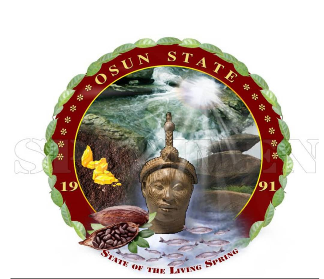
The Circle- The circle replacing the shield symbolised perfection and wholeness.
Y - Though not clearly depicted through the placement of the water, earth, and mountains, in the circle. It represents the three Senatorial districts in Osun State united as one hence the lack of delineation between all three elements.
Osun River: is represented, connected to a Waterfall; Osun state being “State of the Living Spring”, the River situated on the upper part of the Y supplies water to the fertile Brown Agricultural soil of the land on the left. It also wets the Mountains on the right of the Y. The Waterfall also supplies water that nourishes the Leaves and the Cocoa seeds, which also houses the fishes. In essence this represents the source of life and nourishment in Osun State.
Brown Agricultural Soil- This represents fertility and is a source of food. It is located on the left side of the Y.
Mountains- Osun State is renowned for its hills and mountains, hence the distinct representation. It is located on the right side of the Y. Mountains in various contexts represent tourism, hospitality, and spirituality. It is a symbol to draw strength.
Ori Olokun- The Ori Olokun stands for the common origin of the Yoruba race and a great symbol of Osun State especially for Royalty.
The rays of light (Imole in Yoruba)- This represents one of the state symbols as it is depicted in the State Anthem. It symbolizes clarity, enlightenment, hope and guidance, often representing knowledge, truth and understanding. Its placement at the top clearly represents its importance in the state as its rays touch every element/symbol of the state thereby bringing light (progress, success and clarity) to it.
1991- the year the state was established.
NATURAL RESOURCES:
Cocoa leaves / Fruits/Tree / Cocoa Beans- at the base of the coat of arms symbolizes agriculture and the natural resources of the land from food crops to logging to cash crops.
Leaves - (in form of a garland)- These are universally used at the installation of Obas and Chiefs in Yoruba land including Osun State to signify longevity and triumph.
Gold - this is one of the precious stones found in Osun State and it is available in commercial quantities and a great source of revenue for the state.
Fishes – this is one of the natural resources available in Osun State and a source of livelihood for Osun State indigenes.
COLOURS:
Gold - signifies royalty, nobility of the Osun race.
Ruby Red- also associated with nobility.
Orange - symbolizes the hospitable nature of Osun State people.
Yellow - symbolizes the happy nature of Osun State people.
Public response to the new logo
“I am not judgmental at all with design. I am the type to say “it depends… there are different ways to look at these things”… I am a very open-minded commentator on design but… THIS IS THE WORST LOGO EVER! No ifs, buts, maybes…,” wrote Victor Fatanmi, lead partner at FourthCanvas, one of Nigeria’s leading design agencies.
Leye Ogunsaya (Leye Connect), lead designer at Risevest, shared, “As much as most of my colleagues wants to work for a Fortune 500 company and many want to travel, don’t you all think you service will greatly improve the perception of public offices across states and MDAs? Leave fintech alone and apply to your local government today!”
Read Also: Victor Fá: The artistic kid now helping people find what is special about them
“I swear, some Nigerian designers are conspiring to test my sanity. This isn't a logo... This is a full-on assault on my eyes, a war crime against visual harmony, a grotesque cacophony of poorly conceived elements. And to make matters worse, it’s from my state. #MakeItStop,” Tomiwa Allan wrote.
A look through the responses establishes that the new logo is a misstep. The general consensus is that the logo is BAD! Check out more responses
An Honest Assessment
While the effort by the state government to take on such an audacious project is commendable, the result is horrendous, considering the number of talented designers and creatives available in the state.
The previous logo, while not great, is honestly way better than the new logo.
For context, Osun State is one of the six states in Southwestern Nigeria. It is the home to over 25 tertiary institutions such as Bowen University in Iwo, Osun State University in Oshogbo, Federal Polytechnic in Ede, and Obafemi Awolowo University (OAU) in Ile-Ife—which is home to a thriving community of designers and creatives. (OAU has also produced some of the most notable designers and creatives in the country).
Read Also: Is it a design problem or a customer’s problem?
The new logo looks like a joke taken too far. It looks like something someone who just learnt how to use CorelDraw (no shade to CorelDraw, I also use it) conjured together while being instructed on what to add to the logo by a ‘council of elders.’
Nothing about the new design indicates that the designer understands design not to talk of designing an identity of such magnitude and scale.
In simple terms, the new design broke the 5 golden rule of logo design: SMART.
The SMART rule states that a logo/identity should be Simple, Memorable, Appropriate, Responsive, and Timeless.
Before ‘delving’ into what this means, let me mention that the most depressing thing about the logo was the use of low-res images. Who does that?
Read Also: African Flags and Who Designed Them (Part 1)
Now let’s analyse the logo based on the SMART rule:
Simple: Nothing about the logo is simple. There’s a lot going on in the logo because it is trying to say a lot of things. And again, the use of images even makes it worse.
Memorable: One of the common characteristics of good logos is that you can easily draw/sketch them—which ties back to simplicity. And this logo blatantly breaks the rule.
Appropriate: A good logo should be appropriate and relevant to the audience. While the new logo tries to communicate and represent some of the known symbols/icons of the states, it fails to capture them appropriately.
Responsive: For something that would be used across a wide range of cases—from prints to digital platforms, the complexity of the logo, and even worse, the use of images, is going to be a nightmare for designers and printers because when scaled down, most elements of the logo will be lost.
Timeless: Do I need to speak further? I think this speaks for itself. The new logo looks like something that was designed aeons ago.
Read Also: Tomiwa Allan: The problem-solving designer who designed the first Agri-investment platform in Africa
A design recommendation
The team behind this should go back to the drawing board and reevaluate their decision. They need to define why they are doing this and what they hope to achieve with this.
Also, they should hire an actual designer! And let the designer do their job, please.
My design recommendation is that the elements should be stripped to their simplest state and the important and relevant ones should be combined in a simple, memorable, appropriate, responsive, and timeless manner.
A very good example is the identity of Ondo State, Osun State’s neighbouring state.
Related Story
This conversation has once again brought to the fore why we need a functional public office that handles the government’s design and creative projects across state and federal levels.


