Is it a design problem or a customer’s problem?
One reaction is that “It’s a design problem” while the other reaction is that “It’s not a design problem... It is a case of him failing to read what was written on it.
In the last 48 hours, two (2) pictures have surfaced on Twitter and have sparked some interesting conversations on the importance and implications of design in product packaging.
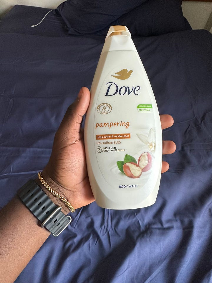
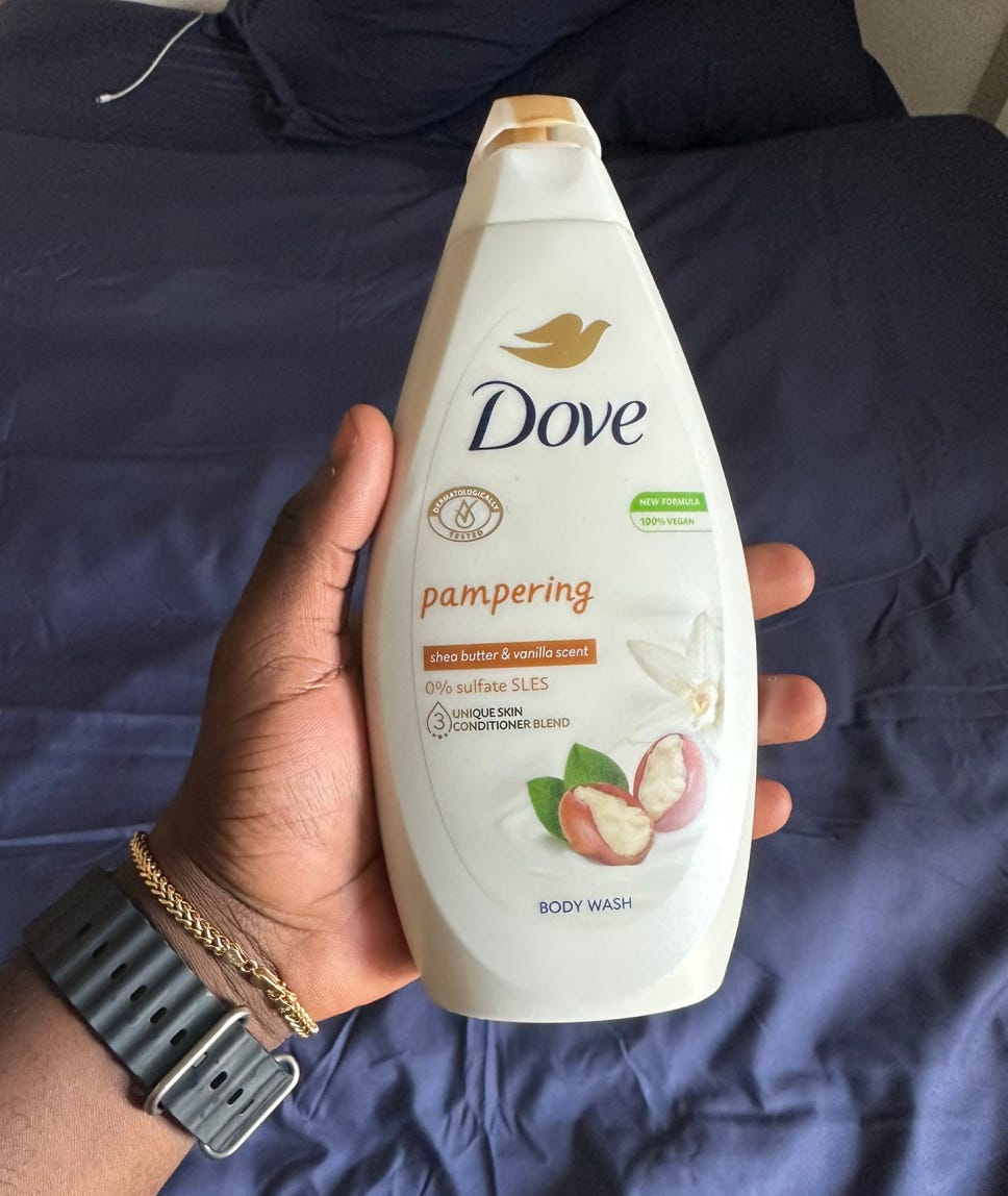
This picture was shared by Twitter user Otunba with the caption;
“I know I am not old, but this is funny.
For the past 3 days, I’ve been using this as my body cream.
I noticed it was unnecessarily sticky and all, but I just felt maybe that’s the texture as it was my first time.
I just found out that it is a body wash!”
https://twitter.com/otunba_od/status/1675821021620731904
There has been mixed reaction to the tweet but they can be summarised into two. One reaction is that “It’s a design problem” while the other reaction is that “It’s not a design problem because ‘body wash’ was written on it. It is a case of him failing to read what was written on it.”
While both camps can be said to have reasonable arguments, it is important for companies and designers to try their best to avoid situations like these. This is a call to designers to be more inclusive and customer/end-user minded when designing products like these especially those that can have huge negative side effects if misconstrued by a customer.
This conversation has made it clear that a number of people don’t read everything on a product package but one thing it did not do is take into consideration that there are a number of factors that can be responsible for it. Dumebi, an experienced designer, captured it well in his tweet;
Some people we design for,
1. Can’t read/just lost their glasses
2. Are dyslexic
3. Will be distracted when interacting with the product
4. Might be a child
5. Have learning disabilities
https://twitter.com/Dum3bi/status/1676229332568612866
Another thing to note is that humans like and tend to depend on familiarity, similarity, and patterns generally which also come into play when buying products. This phenomenon is known as the Consumer’s Mental Model. So it is your job as a designer to anticipate what they will look out for and ensure that your design is clear, accessible, and lacks ambiguity such that it communicates the right thing taking into account different types of customers and users. Elements such as images, illustrations, shapes, colours, and texts are very important and as such be meaningful and relevant to the product. They should also follow the appropriate hierarchy, arrangement, and placement to avoid issues of misinterpretation and mis-categorisation.
Tola Alabi, another experienced designer, made an interesting submission when he tweeted that;
“To a man they all look like body cream. A woman sees things differently. It's not a design problem, if the target audience don't have a problem with it. My dear men, Dove and the likes aren't targeting you. They understand their audience and their audience understand them.”
https://twitter.com/ta_alabi/status/1676304606773538816
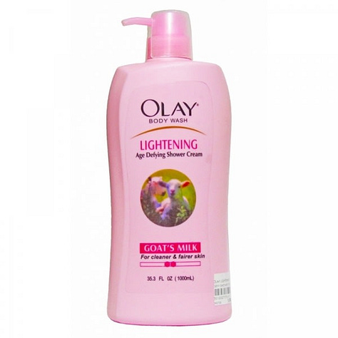
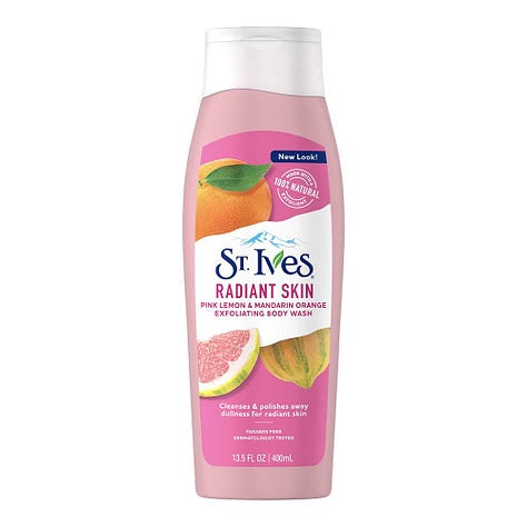
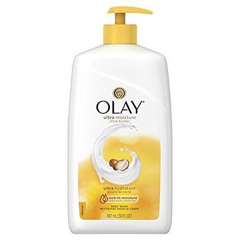
While this take gives an interesting perspective to the discussion, a thread of a lady and other ladies sharing the experience of their confusion with this product and other similar products indicates that the assertion may not be entirely accurate.
A Twitter user Samson Adebayo shared this and people seemed to agree that it ‘solved the problem’.
“Had 15mins to spare and I grabbed my iPad and redesigned the dove packaging without omitting any element from the original packaging… Just my own quick approach to solve the ‘problem’.”
https://twitter.com/Kvngspice_/status/1676318907131392001
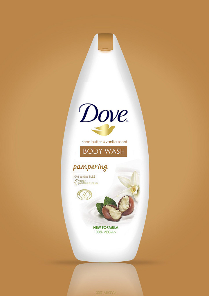
No matter the side of the argument you are on, you will agree that if a ‘tangible’ number of customers and users have the same complaint about your product, it is important that you as a business owner or designer look into it and address it.
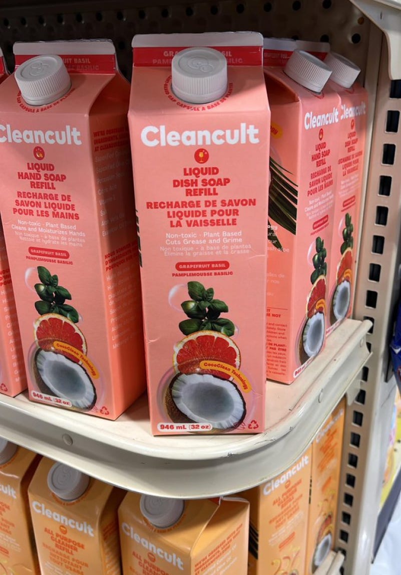
This image was shared by Twitter user Anna with the caption;
“Fruit Juice?”
https://twitter.com/annabrands_co/status/1676160461350359042
If someone offered you this pack without saying what it was, you would have probably opened and drank this without reading what was written on it. But if you drank this, you would have drank a liquid dish soap.
In this case, the consensus is that “This is a bad design”. The reason is clear; the shape and form of the container and the choice of the image used follow after that of popular packaging for yogurt and juice drinks. The packaging mimics that of a popular consumable product packaging and therefore packaging a non-consumable product like a dish wash soap in this case, goes against the established consumer mental model. Without reading the text, 99% of people who saw it assumed it was a new brand of yogurt/juice.
Another Twitter user Brennasaid posted the picture below with the caption;
“This is literally one of the dumbest places to keep undrinkable chemicals I’ve ever seen in my life…”
https://twitter.com/brennasaid/status/1676022393293221892
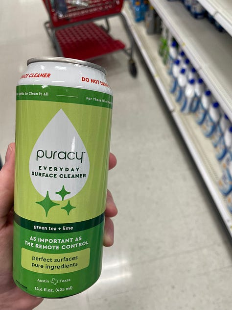
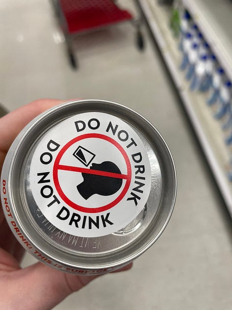
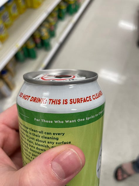
I understand that as designers we want to break the rules and think outside the box but we should not do that to the detriment of the consumers. It is important to understand and think of the impact design decisions can have on the customers, the product, and the business if they turn out to be bad.
A lesson in all these conversations for designers is that when designing for product packaging, they should think beyond just aesthetics and think more about accessibility and inclusivity while also backing their designs with market and customer research.
It also brings to the fore, the importance of product packaging and why businesses should be more intentional about them. It makes clear why businesses should pay more attention to product packaging as it can make or break the product. A good example is the case of Tropical which lost about $30,000 million in revenue due to a failed packaging redesign; in this case, was not even harmful. We have also seen cases of companies getting sued due to bad design decisions.
In summary, product packaging design (form, shape, and visual outlook of the package) can make or break a product, therefore it should be of top priority to businesses and designers.




Well said 🤗