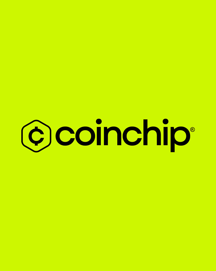
Geneza Brands' new brand identity design for Coinchip symbolises trust and financial safety as it reimagines what it means to invest in crypto
For this project, the Geneza team set out to interpret Coinchip’s brand values and establish it as a unique brand in the competitive cryptocurrency space.
Nigerian-led design studio Geneza Brands has revealed a fresh brand identity for Coinchip, a cryptocurrency platform committed to empowering individuals to maximise their dormant funds through smart investments.
The cryptocurrency industry has seen a lot of growth and an increase in popularity in recent years. But despite the increasing number of players in the crypto space, a lot of people still see cryptocurrency trading as complex, inaccessible, and expensive.
To tackle this challenge, Coinchip designed an app for everyday individuals looking to kickstart their investment journey into the cryptocurrency ecosystem regardless of their crypto literacy.
For this project, the Geneza team set out to interpret Coinchip’s brand values and establish it as a unique brand in the competitive cryptocurrency space. “In our strategic approach to branding, we undertook the task of interpreting the brand's goals and conceptual ideals. This involved navigating the highly saturated cryptocurrency market, characterised by numerous platforms sharing similar objectives and structures,” Joy Baridilo tells The Creatives Note. “Our challenge was to establish Coinchip as a unique and standout brand amid this competitive landscape.”
Joy, a motion designer on the Geneza team, says “We initiated the branding process with comprehensive brainstorming and ideation sessions, carefully analysing the competitors' landscape.”
Serving as a DeFi intermediary, Coinchip uses spare change from a user’s bank account to build an automated, robust crypto portfolio for the user. With as low as $1, any user could begin making profits from crypto trading without stress. “Our focus was on identifying distinctive aspects of the brand, particularly emphasising uniqueness in elements such as logo design,” says Joy.
The Coinchip Brand Identity
The name Coinchip was birthed from the brand’s vision of helping users own digital stock using little chips of their coin or spare cash.
“The logo, resembling a secure vault, was meticulously crafted to symbolise financial safeguarding, aligning seamlessly with Coinchip's mission. As a cryptocurrency platform, Coinchip is dedicated to enabling individuals to unlock the potential of their idle funds through intelligent investments,” Joy explains.


Geneza replicated this uniqueness in Coinchip’s brand color palette, using Chartreuse and Black as the primary brand colors. The brilliance and simplicity of both colors guarantee visibility in an industry dominated by blue hues.
Staying in character, Lilac, Vivid Sky, and Light Coral were selected as secondary brand colors. All of which share the same quality—Simple brilliance.
For the typography, Geneza selected Garet, a modern geometric typeface characterised by a contemporary, friendly, masculine tone. Its distinctive oval shapes are derived from the optically perfect circle and closed counters. Garet is an easy-on-the-eye font with just the right amount of character and formality.
Establishing Trust Through Its Identity
While Coinchip’s mission is clear, establishing trust in a platform for investment has become a formidable task as the crypto investment market grows increasingly crowded. Investors are understandably cautious due to heightened security concerns, prompting them to carefully scrutinise where they allocate their funds.
“Our team effectively addressed this challenge by enhancing the visual identity. We strategically positioned the brand as a secure and trustworthy entity, exemplified through the implementation of the vault concept logo and accompanying illustrations,” Joy explains.
Hyperdrive: Coinship’s Motion Style
For the brand motion design, Geneza captured the futuristic, forward-thinking, innovative approach to crypto trading by adopting a design style called Hyperdrive, an exciting concept from science fiction relating to faster-than-light space travel.
“I found immense satisfaction in overseeing the creation of the motion designs. Specifically, we developed a distinctive motion style named 'Hyperdrive,' drawing inspiration from the concept of faster-than-light space travel found in science fiction,” Joy shares. “This choice was deliberate, intending to communicate sophistication, technological expertise, and unyielding security. The aim was to align our visual elements with Coinchip's ambitious goals and aspirations.”
“Working alongside Geneza to bring to life our vision for Coinchip was an absolute pleasure. The synergy we experienced throughout the entire process elevated the collaboration to a level far beyond that of a typical contracted project. Instead, it felt as though the Geneza team was integrated into our organisation, functioning as our internal design agency, and actively involving our design team from inception,” says Tolu Saba, Lead Designer, Coinchip.
“This collaborative approach yielded a brand identity that surpassed our collective expectations. Our brand now resonates more powerfully with our intended audience, and the feedback we’ve received from our test groups have been overwhelmingly positive.”


