Chisaokwu Joboson talks working with Google Fonts on the Ojuju typeface, the public reaction to its launch, and his mission to create more type support for African languages
The Creatives Note caught up with Nigerian-based brand and type designer Chisaokwu Joboson to discuss the inspiration behind the Ojuju typeface, and how the project with Google Fonts came about
On February 29, Google Fonts announced the addition of Ojuju, a san-serif typeface of an afro-grotesque style, created by Chisaokwu Joboson, a Nigerian-based brand and type designer, to its catalogue.
When the news broke, a lot of Nigerians on social media were super excited. For context: this is the second typeface of African essence to be released by Google Fonts.* So, the news of the addition of Ojuju to Google Fonts marked a significant milestone for type design—and design in general—in Nigeria and Africa.
Following the news, Nigerian designers—and designers from around the world—went out of their way to make designs using Ojuju typeface. It was interesting to see the beautiful application and use of the typeface in the several submissions from designers.
Read Also: Google Fonts adds 2 typefaces—created by a Nigerian and a Zimbabwean designer—to its catalogue
To understand the inspiration behind the typeface and how the project came about, The Creatives Note caught up with Chisaokwu Joboson, the Nigerian-based brand and type designer, who designed the Ojuju typeface.
From Graphic Design to Type Design
Joboson’s journey into design, like that of many Nigerian designers, started out in graphic design. “I started out as a self-taught graphic designer. But along the line, I developed a likeness for logo design, which I did for a bit before diving into brand design,” Joboson tells The Creatives Note.
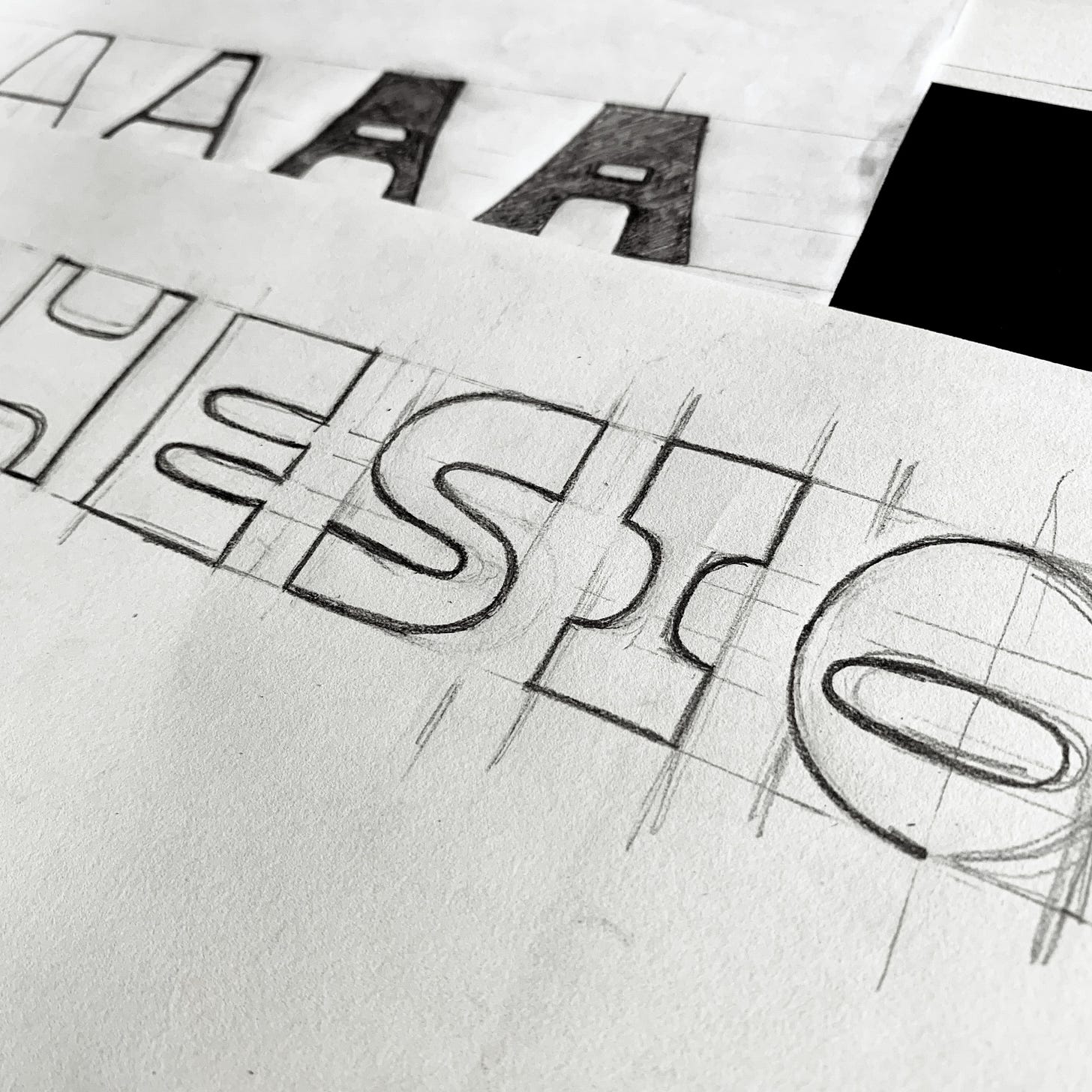
As a brand designer, he quickly realised his love for creating custom logotypes when designing brand identities. “In my work creating brand identities, I enjoyed creating custom types for the logo marks I designed. Many times, I would decide to create the logotype from scratch,” says Joboson. “That was my first entry into the world of type creation.”
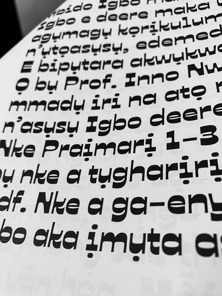
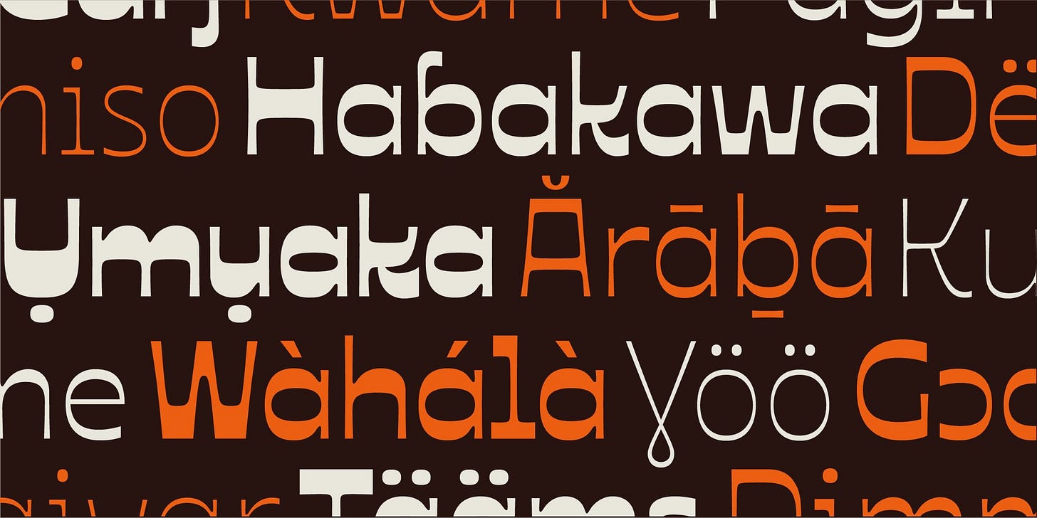
After designing brand identities for some African brands, he observed a problem: Most typefaces didn’t cater to African languages. “Over time, I realised that in trying to find typefaces, while I found some that I loved, most of the typefaces available lacked African letters and symbols that could be used to properly communicate to an African audience,” he shares.
“This made me feel like African languages were really under-represented and overlooked by type designers. They made support for Latin and a few other languages and moved on.”
This observation led him to explore type design. “I saw that problem and felt that it would be nice to be one of the people who would do something to solve it,” he notes.
Google Fonts called, Joboson answered
While exploring logotype and type design, Google Fonts came calling, says Joboson. “Last year (2023), Simon Charwey—who I like to call an African design visionary—reached out to me to ask me if I would be interested in a type design project by Google Fonts. He said that they were looking to work with African designers to create typefaces that would incorporate and support African languages, and I said yes I would be interested,” Joboson tells The Creatives Note.
Read Also: AFCON 2023 Identity: A Beautiful Story of Strength and Unity through Football
At the time, Joboson had never designed a typeface before so he sent in the logotypes and African-centric design he had created as his submission. “Months after the conversation with Simon, I got a message from Dave Crossland about the project. And after a few conversations, I got commissioned to work on the project,” he shares.
“I had even forgotten about the conversation with Simon when I got the message because the conversation happened in the first quarter of the year and I didn’t hear from Google Fonts until September or so.”
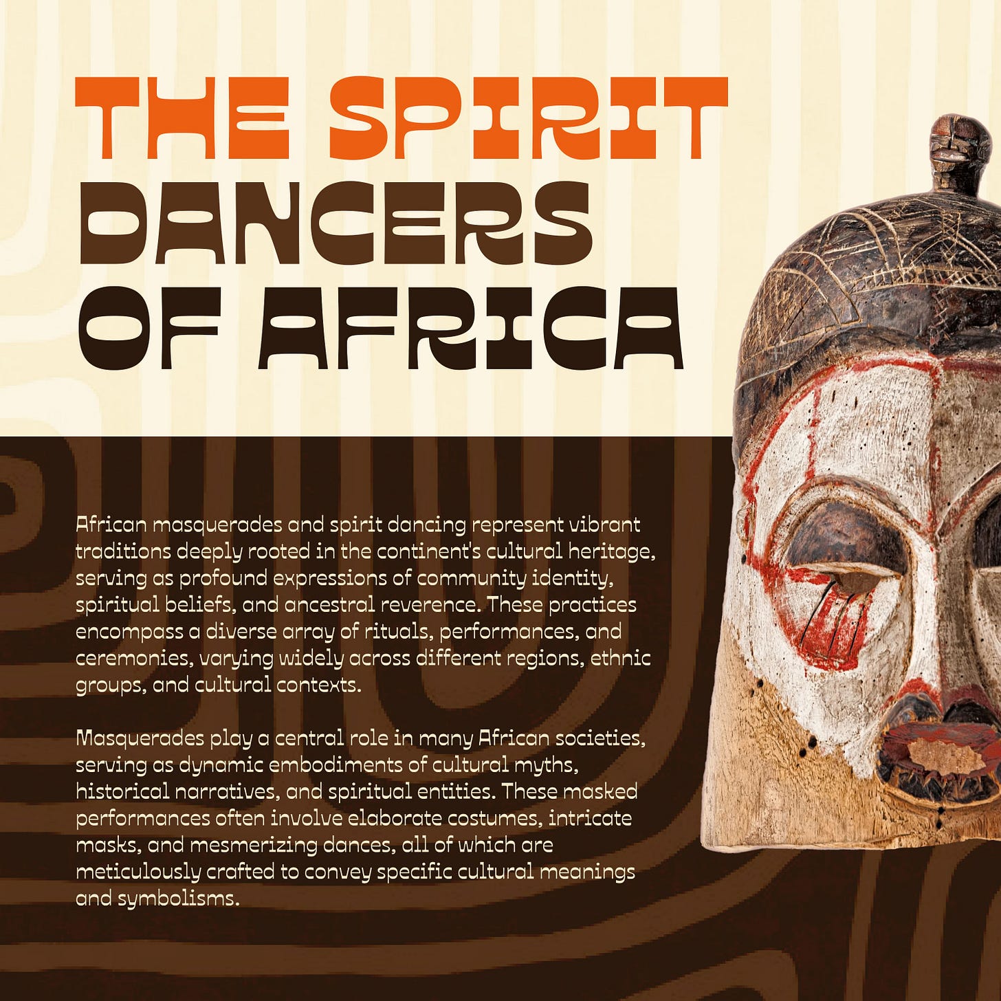
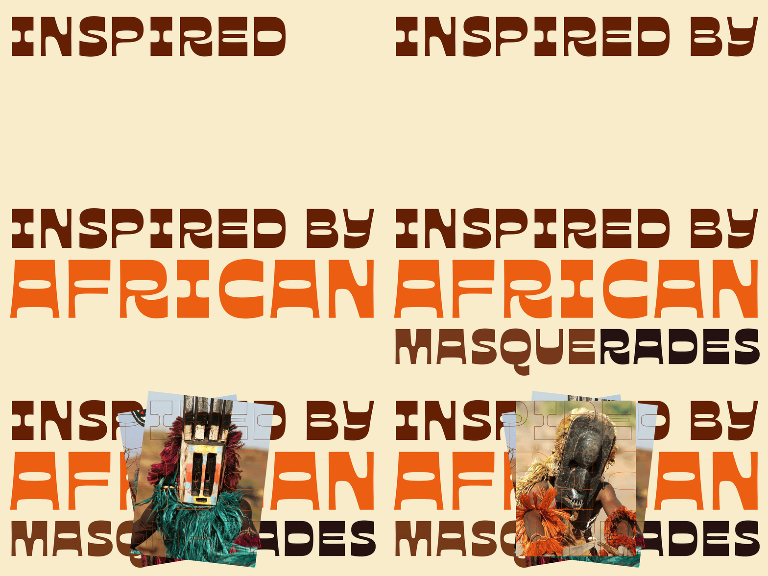
Ojuju: Inspired by African masquerades
According to Joboson, Ojuju was inspired by African masquerades. He reveals that he had this fascination for African masquerades growing up.
“As a young kid, when I visited my home town in Enugu, there were these festivals where masquerades performed. And on most occasions, you would find people running away from and towards the masquerades when they try to come closer to them,” he shares.
“I always wondered about the concept behind masquerades because when you come to Lagos, you see the same concept replicated in the form of ‘Egungun’ or ‘Eyo’ during the Eyo festival,” he adds.
“Different masquerades had different masks but they always did the same thing; if they are not dancing, they are running around or wowing people with some mysterious trick.”
These memories stuck in his head growing up. So when the opportunity to design a typeface came, Joboson says he thought about designing a typeface around African masquerades. “I don't really know why but that was what came to my mind at the time,” he shares.
“When it was time to name the typeface, Ojuju just came to mind and I decided to go with it.”
Working (and learning) with the Google Fonts team
Joboson says he went into the project with the knowledge he had about design and his experience designing logotypes but he knew that designing a typeface was a lot more than that. But thanks to Google Fonts, he was able to learn about type design properly.
“There was a lot of support in learning and working on the project. I got feedback from people who were more advanced in type design.”
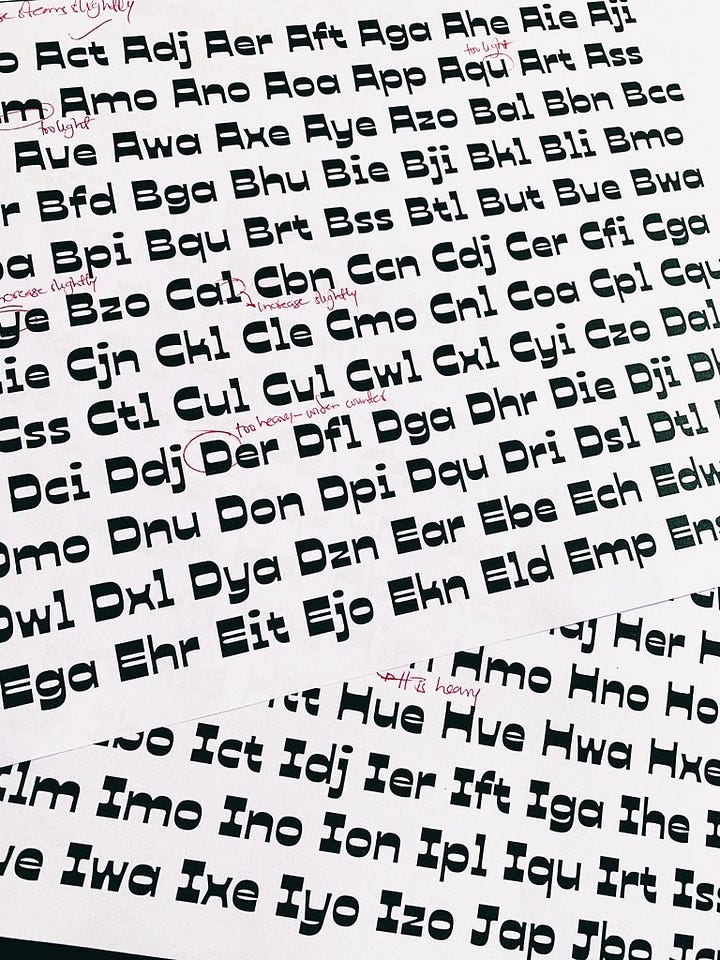
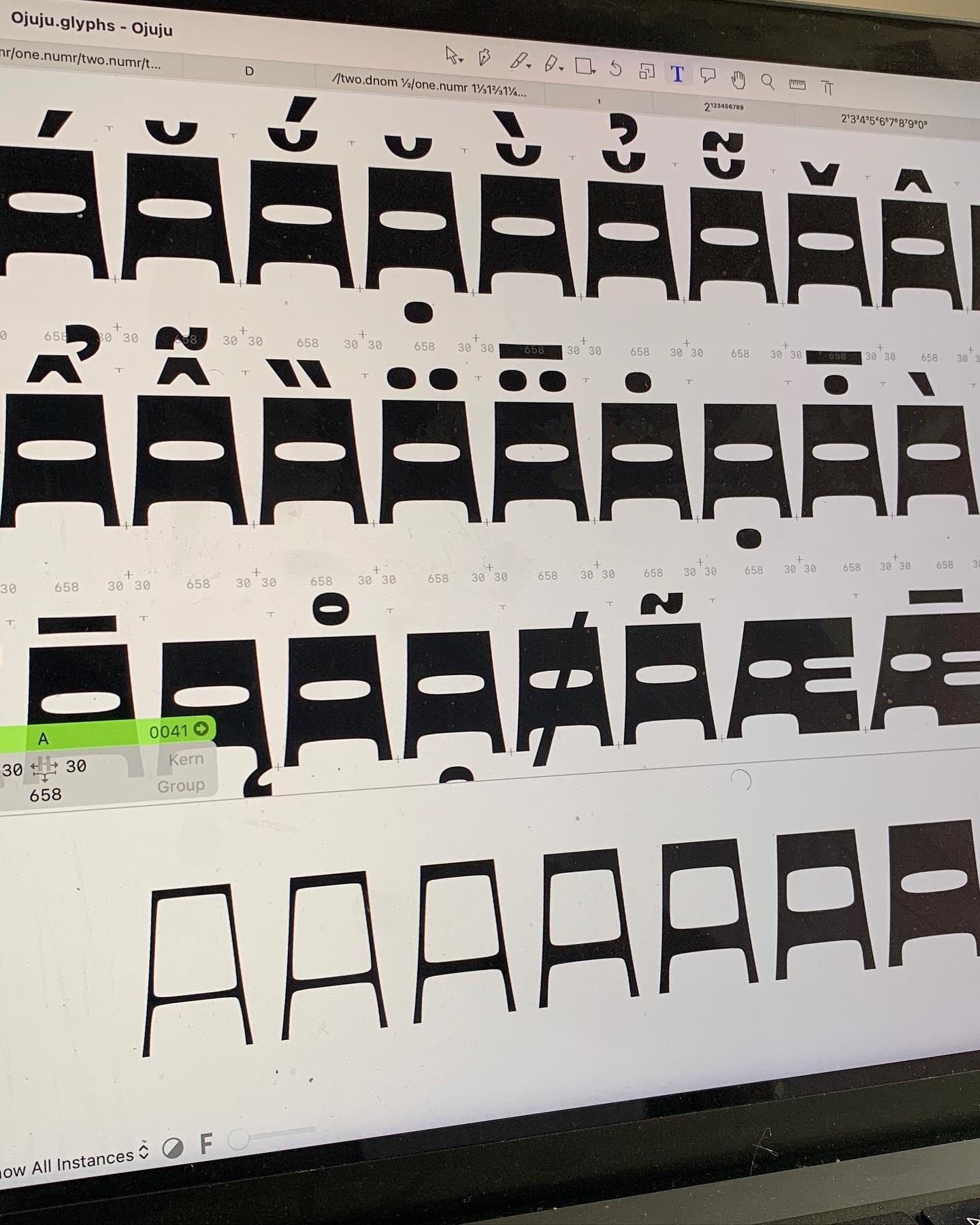
With Ojuju being a reverse contrast variable typeface, Joboson says there were a lot of things that had to be considered, which he had to learn on the project.
“Considering the fact that it was my first typeface, it was quite a bold and difficult thing to do. But with direct supervision and design guidance from Mirko Velimirovic, who I would call a mentor and a collaborator, I was able to get the idea done right,” he shares.
“The choice of making it a reverse contrast variable has to do with designing something of African essence. I feel like African design, in certain cases, is meant to break the rules of design in a good way. I like to see African design as chaos; good chaos, chaos that works.”
The whole project was a great learning experience, says Joboson.
Public reaction and feedback
“The reaction has been overwhelming,” says Joboson, referring to the public’s response to the release of Ojuju. Even though he occasionally thought about the significance of what he was doing while working on the project, he didn’t envisage such reactions. “I didn't expect such reactions. I was really humbled and overwhelmed,” he admits.
“My notification blew up. Every day, I get a notification of someone who posts about Ojuju and how they are using it—whether rightly or wrongly (I am not judging, haha).
Read Also
“It was interesting to see people use and talk about it. It was a beautiful experience.”
As big as public reactions and impact go, Joboson says Ojuju is his biggest project for now. “There was a time I would go on Google Fonts to admire typefaces. Getting to create one for them is a dream come true,” he says.
What next?
With the success of Ojuju, Joboson plans to do more type design projects. “I guess I can now call myself a type designer,” says Joboson. “I am still fascinated with type design and I feel like I have a mission to contribute to more typefaces supporting African languages.”
This project has made him find one of his purpose in design, he says. “Everything has led to this point where I have now found a mission in helping to get more type support for African languages,” he shares.
The project also made him realise the work that still needs to be done when it comes to the global inclusion and adoption of African languages, scripts and writing systems in type design. “It's like a case of opening a Pandora box; once you open a box, you see more problems,” says Joboson.
“After working on Ojuju, I realised that there's a need to create support for more African languages and scripts,” he explains. “I believe it's a gradual process, and I hope that the release of Ojuju would spark more conversations about the problem, and would lead to more people contributing to solving the problem. But my focus right now is getting support for as many African languages as possible.”
Ojuju was released under Udi Foundry, the independent type foundry Joboson founded—which he calls his birthchild. “I have a number of ideas on different typefaces and I am currently exploring and working on 5 different typefaces, all of African essence, which I would like to put out,” says Joboson. “I am also exploring non-African typefaces. I am just having fun.”
Check out the Ojuju typeface on Google Fonts.
* The story originally stated that “Ojuju was the first of its kind from a platform with a global reach like Google Fonts”. Ojuju is the second typeface of African essence to be released by Google Fonts. (“Agbalumo” by Raphael Alẹ́gbẹ́lẹ́yẹ̀ was the first).
Editor’s Note: At The Creatives Note, we are looking to cover and tell more stories of things going on in the African design industry, please reach out to us with tips, news, insights, projects, ideas, and stories via email at thecreativesnote[at]gmail[dot]com.







Congrats to the Udi Foundry team, looking forward to more groovy releases!