Toby & Tye reveals gamp's new visual identity aimed at positioning it as a reliable lifestyle brand and not just a phone repair brand
The revamped gamp’s visual identity system created by Toby & Tye uses a vibrant palette, versatile typeface, and minimalist design. It also introduced a new style of imagery that embodies the brand
Toby & Tye, a Nigerian brand consultancy and design agency, unveiled a new visual identity, website, and brand design for gamp, a consumer-centric brand that provides a range of services to help customers repair and fix their devices, as well as offer insurance against future damage.
The new identity is said to be a part of a transformative rebranding journey by gamp. In what is said to be a very collaborative effort between the Toby & Tye team and gamp’s team, the project was led by Tobi Adesina, the founder of Toby & Tye.
“They were intentional about every aspect of the brand. And they were very curious and weren’t afraid to ask us questions,” Tobi tells The Creatives Note. “They didn’t just tell us what they wanted and expected us to execute. They were open to new ideas. They gave us the floor to convince them even though some of that took time. But they were ready to listen and it made the whole engagement very interesting.”
gamp is said to have started out as a phone repair shop that repairs and fixes gadgets. They pick up the gadget, repair it, and deliver it back to you. They had been in the market for several years, but their presence remained relatively unknown so they enlisted the help of the design agency, Toby & Tye, to fix that.
“With this redesign, we set out to position them as a lifestyle brand and not just a service delivery brand,” says Tobi. “After the brand audit exercise, we realised that the devices people use are a big part of them. For example, most people can’t go a long time without their phone.”
People use their laptops and phones to get work done, stay productive, and have fun. From watching videos, tweeting, texting, chatting, communicating, and streaming matches, these gadgets are a big part of people’s personal lives. If anything happens to the device, it interrupts their whole life.
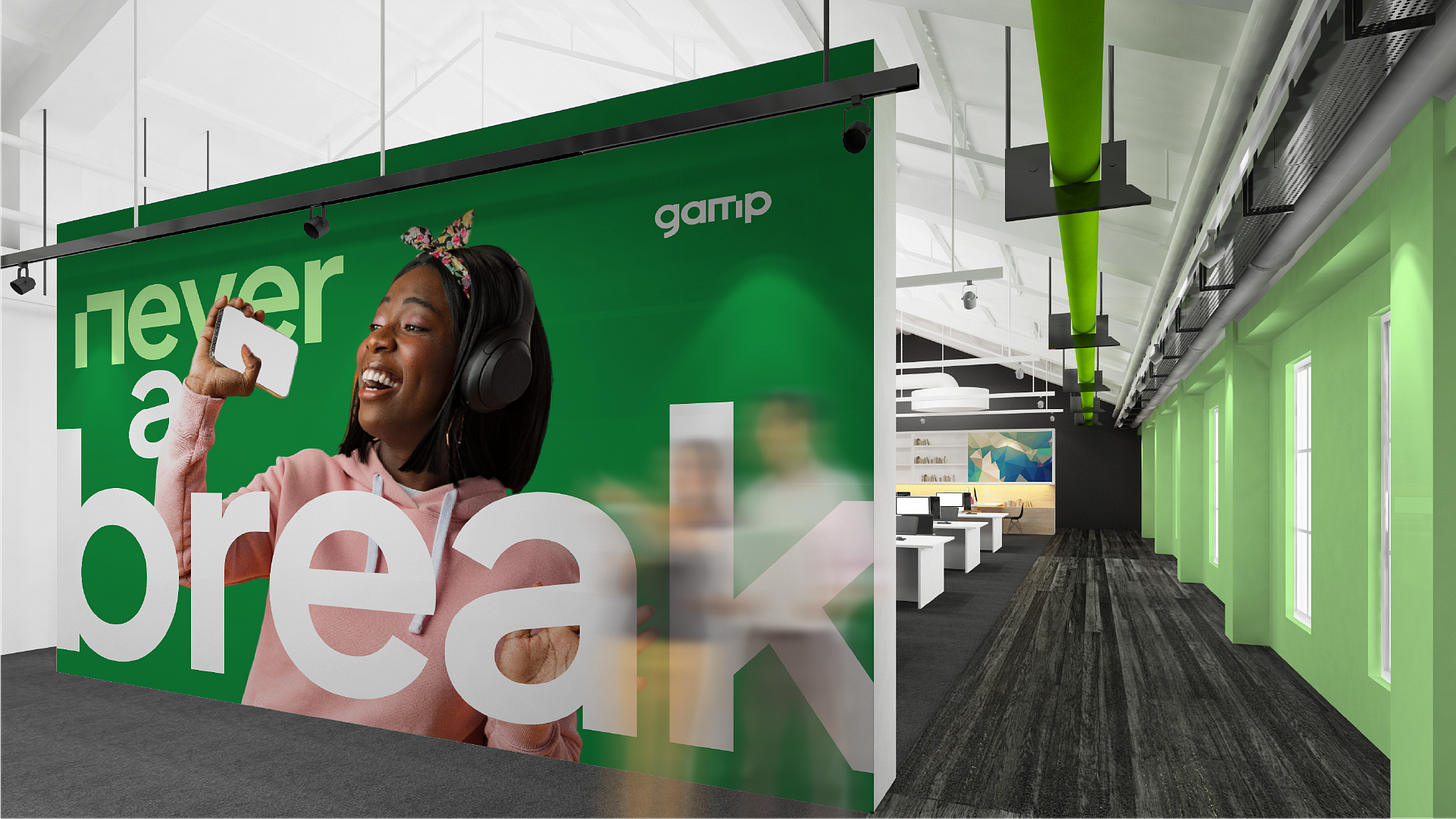
“Our analysis and strategy session led us to come up with the tagline; ‘never a break’, which summarises what they do,” he explains. “Never a break is a double entendre that reflects gamp's unwavering dedication to meeting their customers' needs by repairing broken devices and also shows that gamp guarantees uninterrupted service because they have an option that offers you a device you can use temporarily while they repair your own device.”
The new positioning allows gamp to be able to participate in ongoing conversations as they are a part of people’s life because of the guarantee and safety they provide for their customer’s devices; which are a big part of the customer’s life.
The Visual Identity
The initial logo was crafted from a simple device icon and was not recognizable and failed to reflect the company’s commitment to exceptional customer service.
The revamped gamp’s visual identity system created by Toby & Tye uses a vibrant palette, versatile typeface, and minimalist design. It also introduced a new style of imagery that embodies the brand’s youthful and daring spirit.
The brand’s font collection, Plus Jakarta Sans, features three distinct styles—a commanding Bold, a self-assured Regular, and a versatile Sans. With these options, the brand can consistently convey its brand message across various media channels.
Read Also: African Flags and Who Designed Them (Part 1)
The traditional green color of the brand was retained to solidify its presence and position in the industry. Furthermore, they expanded the color palette to include three primary colors and five secondary colors to be used as accent colors in other applications and treatments such as imagery and illustrations.
Also, they left “the box” behind, a bold statement about the rapid growth of the brand and a mindset that cannot be confined. The word “gamp” is also presented in lowercase to communicate accessibility, openness, and transparency.


“The actual design work and experimentation took about 3 - 4 months but we spent a lot of time tinkering with the strategy and had to revise the vision, mission, tone, language, and the brand archetype to make sure we nailed it,” he tells The Creatives Note.
Read Also: Opay reveals new logo and declares the dawn of a new era
“When we first started out, we were known as just another phone repair shop. But we always knew that our mission went far beyond that. That’s why we’ve taken this bold step to communicate our deepest commitment with this new look. Our goal remains the same—to humanise your device experience,” says Bolu, the founder of gamp.
“We have evolved beyond simply fixing devices; we now focus on understanding the purpose behind your precious tech and how it integrates into your life. We recognise the vital role that devices play, and we ensure that unexpected events don’t hinder productivity, entertainment, and social connections by simplifying device ownership and maintenance for individuals and businesses alike.”


That's pretty diligent for a consumer service! Great initiative from the gamp team.