Seyi Olusanya on getting into type design, founding Afrotype, and collaborating with Google Fonts
In a conversation with The Creatives Note, Seyi Olusanya, the founder of Afrotype, talks about getting into type design, founding Afrotype, and collaborating with Google Fonts.
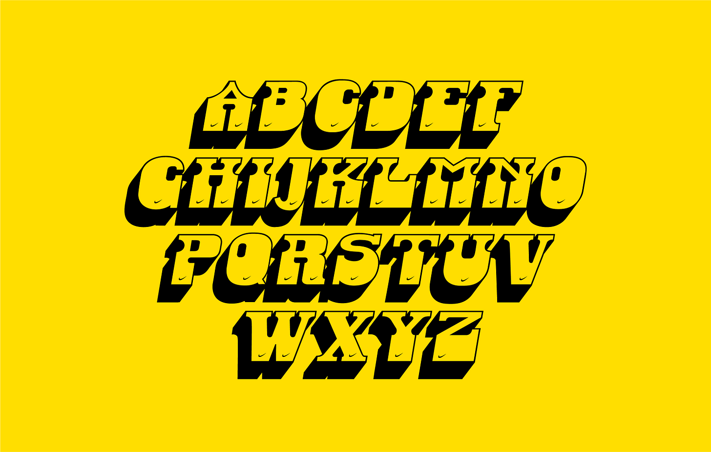
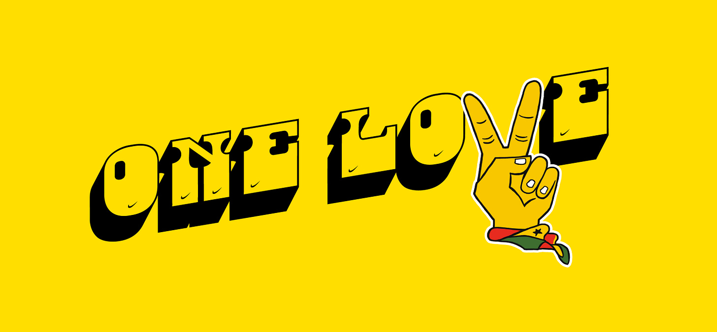
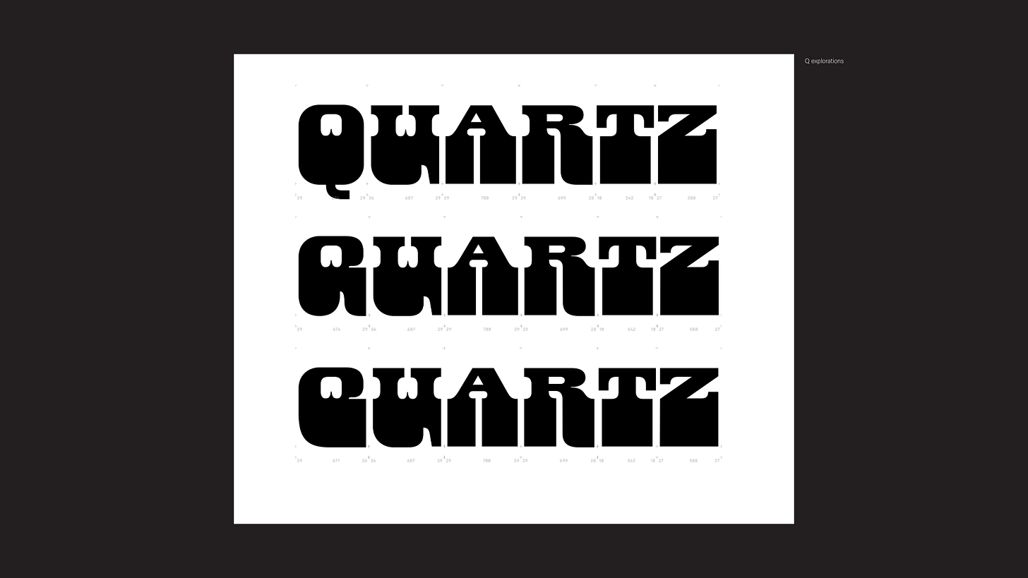
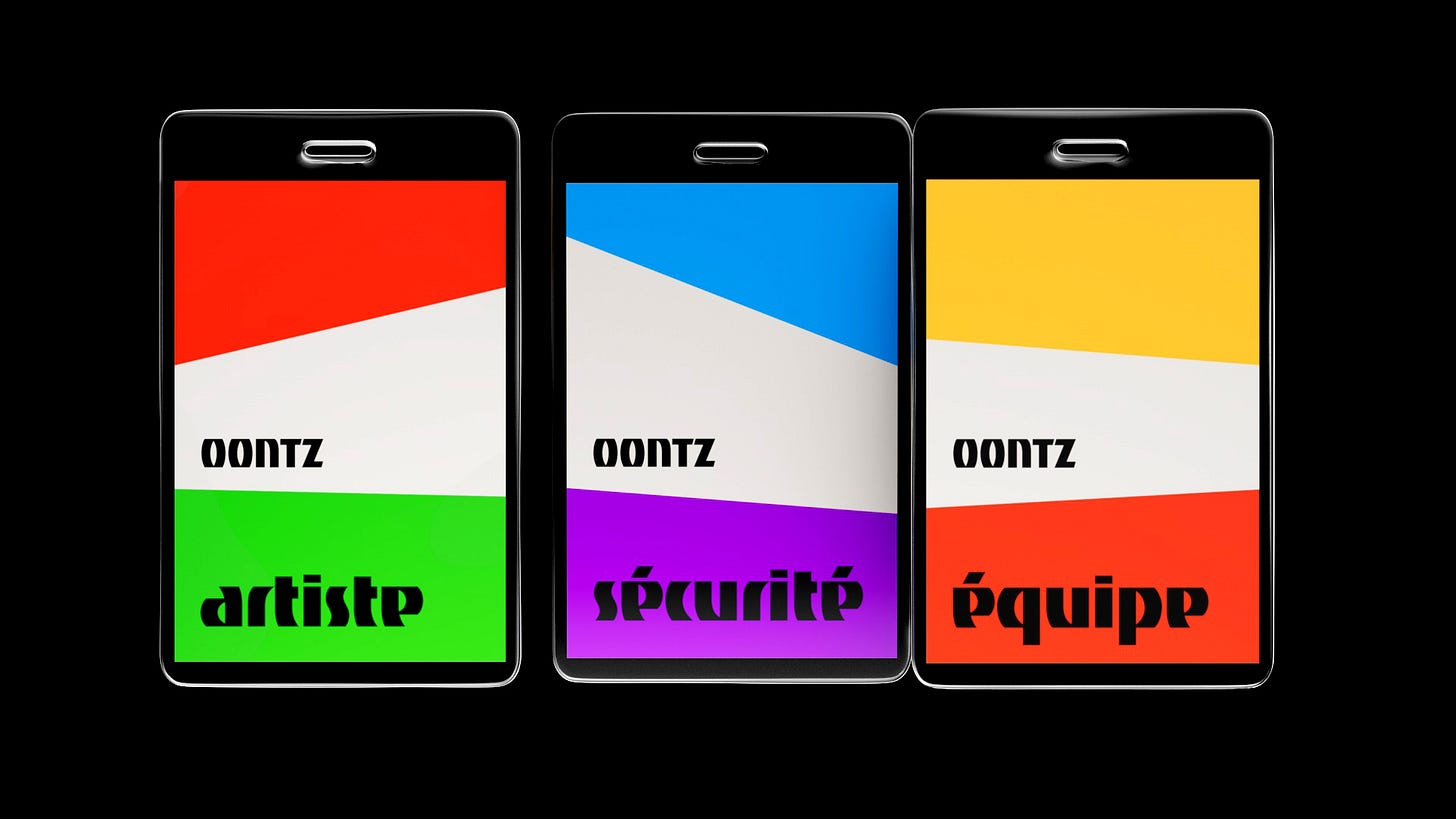
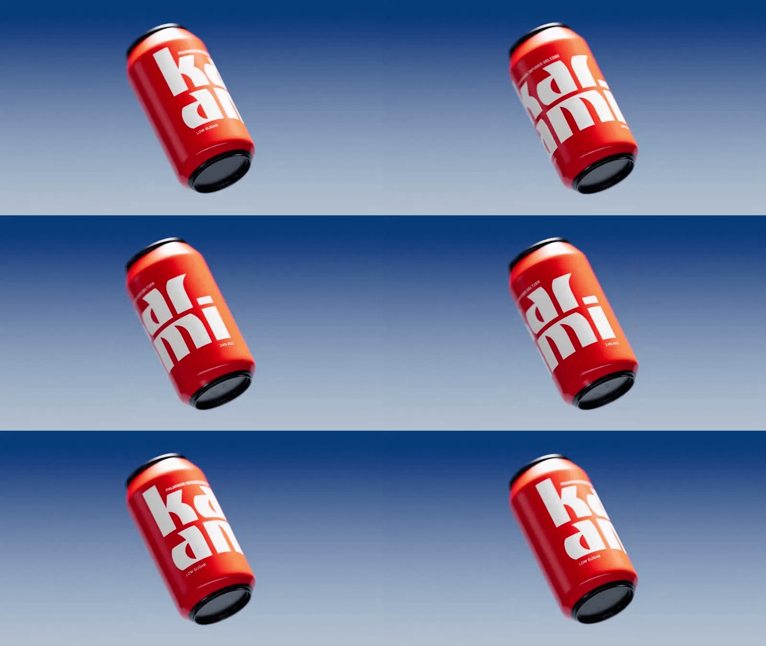
In April, Google Fonts announced the addition of Tac One, a single-weight, bold Sans Serif typeface, designed by Afrotype—a Lagos-based type studio founded by Seyi Olusanya—to its catalogue. One month later (in May), it also announced the addition of Danfo, a tuscan serif font inspired by vinyl stickers on the ubiquitous Danfo buses of Lagos, another typeface designed by Afrotype to its catalogue.
In a conversation with The Creatives Note, Seyi Olusanya, the founder of Afrotype, talks about getting into type design, founding Afrotype, and collaborating with Google Fonts.
Getting into type design
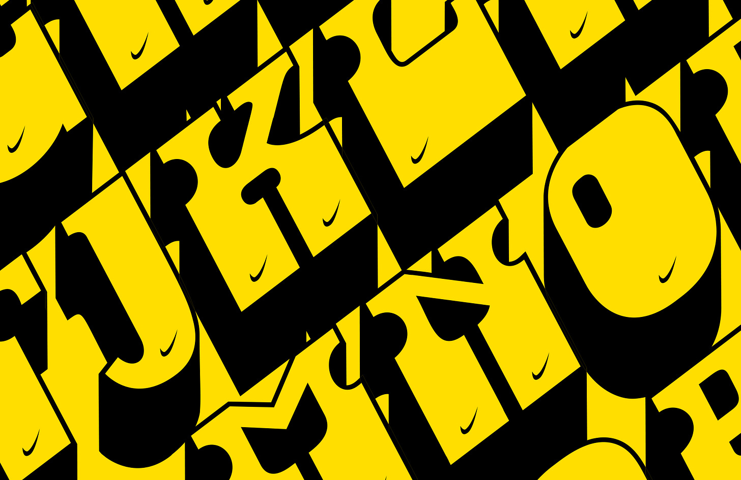
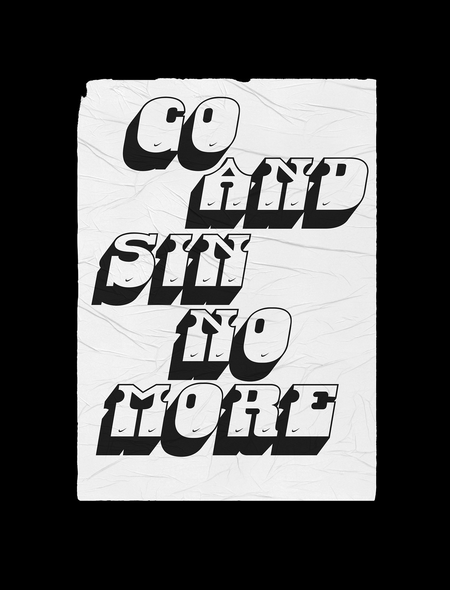
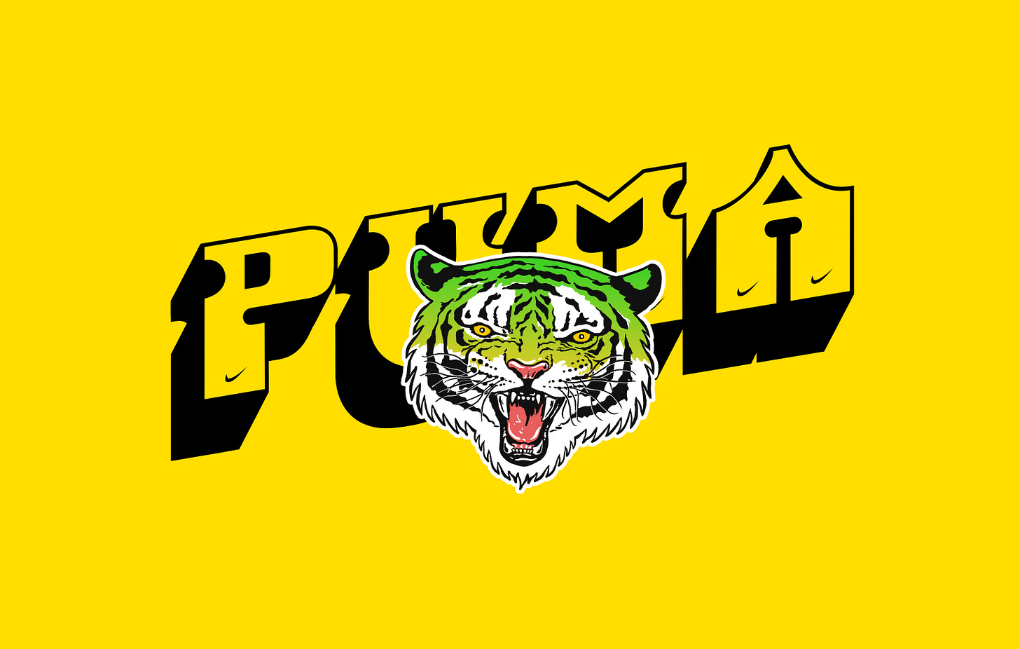
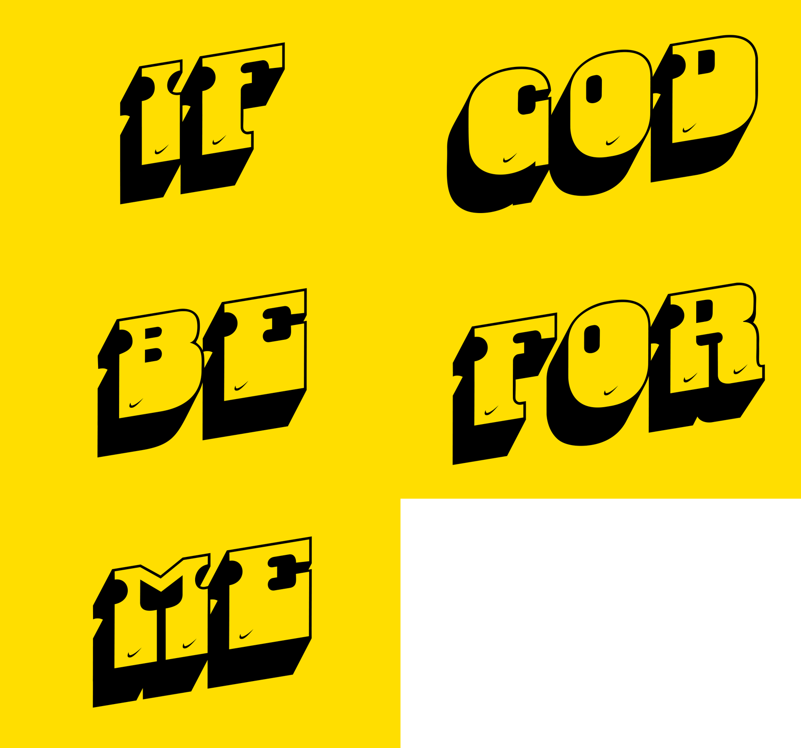
In 2018, Seyi designed and released Danfo Std, a font inspired by Danfo—the yellow buses with black stripes used for public transportation in Lagos. “Outside of the obvious yellow and black, these buses are mood boards and outlets for their eclectic and animated drivers to express themselves. One of the most common being the font used to create rich stickers that boldly speak their truth,” the case study on Danfo Std noted.
“Drawing inspiration from these fonts, we’ve created the typeface Danfo Std to increase and extend the range to which we can milk and rely on the striking energy and aesthetic of Danfo buses to further our collective identity.”
According to Seyi, who started his graphic design career designing flyers in uni, Danfo Std was his first foray into type design. “I designed Danfo because I was eager to translate something cultural into a format that other people could use,” he tells The Creatives Note.
“I got Danfo Std done and put it out into the world. And that was my first foray into type design.”
“I was very much in touch with what contemporary design practice and culture in other parts of the world was like. I noticed that there were type designers and foundries that were inspired by their surroundings and culture,” he says. But when he looked around in Nigeria, he says, there weren't that many people doing that. “Karo Akpokiere was the only person I found who had made a typeface inspired by syringes,” he recalls.
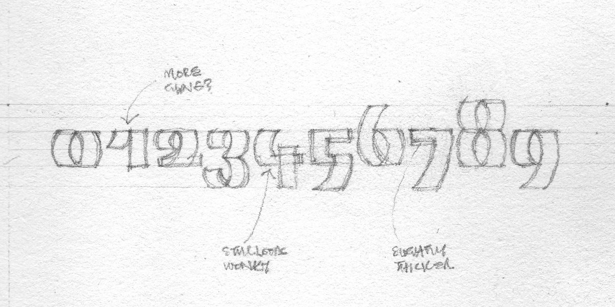
As someone who likes challenges and likes to learn new things, he set out to learn type design—and design a font while at it. “I like to learn to make new things, so I downloaded Fontlab and went to Palmgrove bus stop—the closest bus stop to my house at the time—to take pictures and get inspiration for the font I wanted to work on,” Seyi recalls. “I started reading about type design while learning how to use Fontlab at the same time.”
Designing Danfo Std took about six months, says Seyi. “Because I had a job running the studio at the time, I only worked on it in my spare time,” he says. “I got it [Danfo Std] done and put it out into the world. And that was my first foray into type design.”
He also adds, “I wanted to build a personal brand around progressive African design—making African design projects that feel contemporary and pushing quality forward.”
Read Also: Google Fonts adds 2 typefaces—created by a Nigerian and a Zimbabwean designer—to its catalogue
Finding African-inspired typefaces
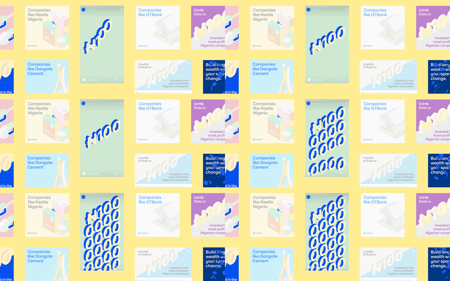
At the time of designing and releasing Danfo Std, Seyi, who studied Architecture (BSc) and Environmental Design (MED) at the University of Lagos, was leading art direction at Dá Design Studio, a brand identity design studio he co-founded with Damilola Marcus. (Dá Design Studio, which officially closed its doors in 2023, provided boutique brand solution services for ambitious and progressive businesses through design research, experience design, graphic design, design writing, visual identity design, verbal identity design, interaction design and motion design. Some of its clients included Nigeria’s leading companies and startups such as Paystack, Cowrywise, Rise, Mono, and Green Africa Airways.)
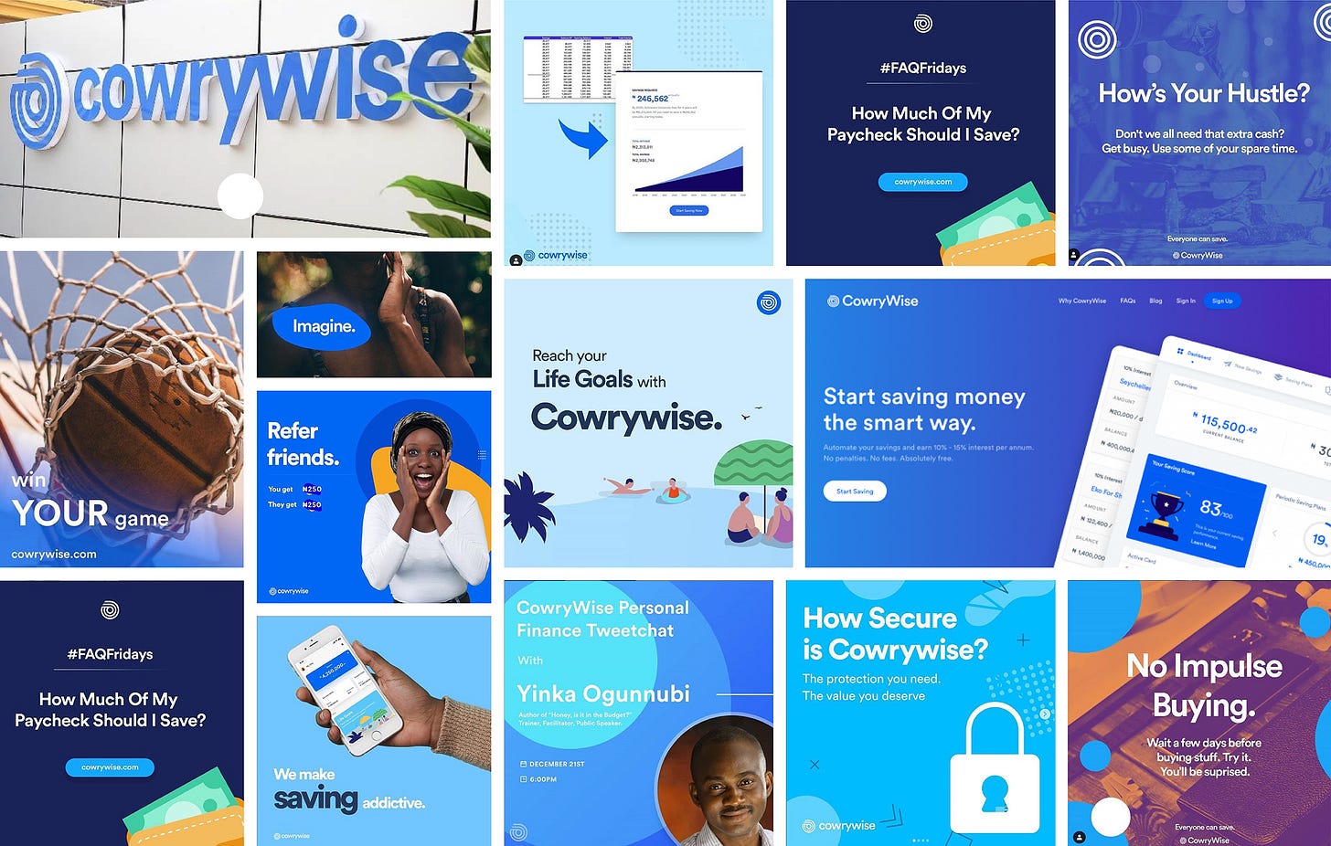
As an art director in the context of branding, Seyi says, deciding on the typeface to use for a brand is an important part of your work. And having to constantly deal with the need for unique typefaces when working with new clients inspired and further ignited his interest in type design, he notes. “Another important detail [of why I got into type design] was my experience with client projects while running the studio,” he tells The Creatives Note. “When we worked with Nigerian startups on branding projects, we would go on French and American type foundry websites to look for typefaces that resonate with art direction we had designed.”
After doing the hectic work of brand strategy and understanding their [clients’] primary audience—which are mostly Africans, Seyi says, it felt weird that they had to go to foreign type foundries to find typefaces for their projects. “I thought it would be cool if there was an [African] type foundry with typefaces inspired by African culture,” he tells The Creatives Note.
“After my experience with Danfo Std, I had it in mind to start making type properly...I started looking for inspiration online and I found Festac 77.”
“Type is a fundamental component of culture. It's how our words are written, the physical form they take. It carries an emotional quality that can strengthen or detract from a message. As Africans, we have an incredible history to draw from. There are rich stories to tell. These stories are not just told; they are also written. They can be written more effectively,” Seyi noted in a post.
Seeing the need for an African type foundry, Seyi began researching more into type design and started Afrotype as the outlet for his type exploration. “After my experience with Danfo Std, I had it in mind to start making type properly,” he says. “I started looking for inspiration online and I found Festac 77.”
Founding Afrotype, a type studio for African-inspired typefaces
“Closing the [design] studio, I knew that Afrotype was one of the things I was going to focus on,” says Seyi. With Afrotype, Seyi wants to build “a catalogue of typefaces that are genuinely African—and grounded in our culture and history.”
He notes that starting Afrotype was also influenced by the global adoption of our [African] art and talent. “When you watch shows/movies that are titled in indigenous language on platforms like Netflix, you will notice that the titles with diacritics, sometimes, look hacked,” he explains. “It’s like they find a font that looks like what they want and just add the diacritics to it manually because hiring type designers with the required expertise costs a lot of money.”
He adds, “Or you find that someone is inspired by [our culture], but they don’t really have the expertise to translate it the way a type designer would.” These are all opportunities for type designers here, says Seyi, highlighting the increasing need for type designers with African root.
Read Also: AFCON 2023 Identity: A Beautiful Story of Strength and Unity through Football
The decision to delve into type design was also influenced by the bar of quality that type controls, says Seyi. “Something I don't enjoy about designing brand systems for businesses is that you don't have any control over the project once you hand off the project,” he explains. “You have done the work and handed it off with as much guidance as you possibly can, but it’s up to the internal team to maintain it and in some cases progress it, which rarely happens—even with established agencies.”
“With type design, there is a limit to how much you can edit. There’s a limit to what people can do to mess up the output...So, I found type design attractive because it gave me back some sense of control.”
It is a lot of work if you want to do it well, he tells The Creatives Note. “It’s a lot of hard work. Good brand designers are typically generalists; you are rarely going to find a good brand designer that's just good at one thing, which can make work tedious and overwhelming.”
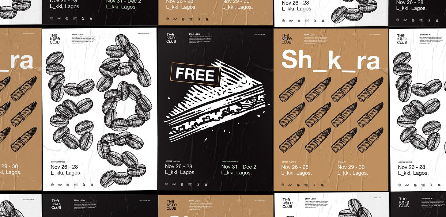
So, according to Seyi, the inability to control the end result of a brand design project is one of the things that made type design attractive to him. “With type design, there is a limit to how much you can edit. There’s a limit to what people can do to mess up the output,” he explains. “So, I found [type design] attractive because it gave me back some sense of control.”
For Seyi, considering the need for an African type foundry, the global adoption of African art and talents, the bar of quality that type controls, and the support from Google Fonts, “It felt like the right time to start Afrotype.”
Collaborating with Google Fonts on Danfo and Tac
According to Seyi, even though Afrotype would have happened anyways, the collaboration with Google Fonts accelerated the launch of Afrotype. “After we closed the studio, my plan was to take a year sabbatical to travel the world and explore. I was eventually going to do Afrotype at my own pace but Google Fonts came with funding and mentorship. They sent us materials, resources, and books. They also paid for licenses and courses and gave us access to amazing and talented type designers,” he tells The Creatives Note.
“I thought it was a scam when I first got the email,” says Seyi, on the collaboration with Google Fonts. According to him, Dave Crossland, who works with Google Fonts, reached out to him. “I think Dave had seen and downloaded Danfo Std when I released it,” he says. “I remember seeing on the analytics then that someone from Europe had purchased it [Danfo Std], and I was like, ‘Oh, cool.’”
But when he got the email about the collaboration with Google Fonts, he says, “I ignored it for some time because I didn't take it too seriously. Also, it was during the heat of the final project we were working on at the studio.”
He adds, “One day I calmly read the email and searched for his name [Dave Crossland] on LinkedIn and realised that he was real, so I replied to the email.”
“Initially, it was supposed to be just me…but I didn’t want to work on it alone because I thought it would be cool to empower other people, which would make the type design ecosystem here grow faster.”
After some email exchange, “We got on a call, and he told me that they were in the process of working with African designers on a type project.”
For the project, Google Fonts got designers from Africa who had some proof of work and genuine interest in type design and gave them the resources they needed. “After a couple of conversations, I was in talk with Thomas [Phinney],” he says.
Related Interview
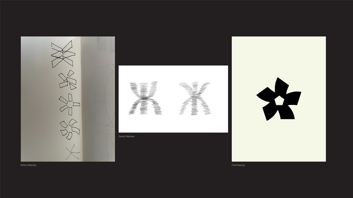
“Initially, it was supposed to be just me, and I had started the research and art direction, but I didn’t want to work on it alone because I thought it would be cool to empower other people, which would make the [type design] ecosystem here grow faster. So, I decided to find people who had started exploring type,” says Seyi, on bringing in collaborators to work on Tac and Danfo with him. “I reached out to David [Udoh] because he had shown me some very interesting type work he was working on, and I also reached out to Eyiyemi [Adegbite] who had made Faaji typeface.”
He adds, “I decided to bring them on board and the working experience was really cool. We had access to support from experienced type designers who gave us feedback periodically.”
For the project, the trio worked directly with Mirko Velimirovic, who was their main mentor. “He held our hands through the project, giving us feedback, advice, and insight into the software and teaching us about the type ecosystem in the US. Without him, there's no way we could have achieved what we did in the timeframe we did,” Seyi notes. “He [Mirko] was absolutely instrumental.”
“I learnt a lot about the type design process. I also learnt a lot about asking the right questions.”
They also got tons of support from Dave Crossland, Thomas Phinney, Lizy Gershenzon and Travis Kochel, Ksenya Samarskaya, Laura Meseguer and boomstho (Amoke Adey), according to Seyi.
Read Also: Google Fonts adds Tac One—a typeface created by Nigerian design trio—to its catalogue
Speaking further on his experience working on the project, he says, “I learnt a lot about the type design process. I also learnt how to ask the right questions. It was very tedious working on two typefaces (Tac and Danfo) at the same time.”
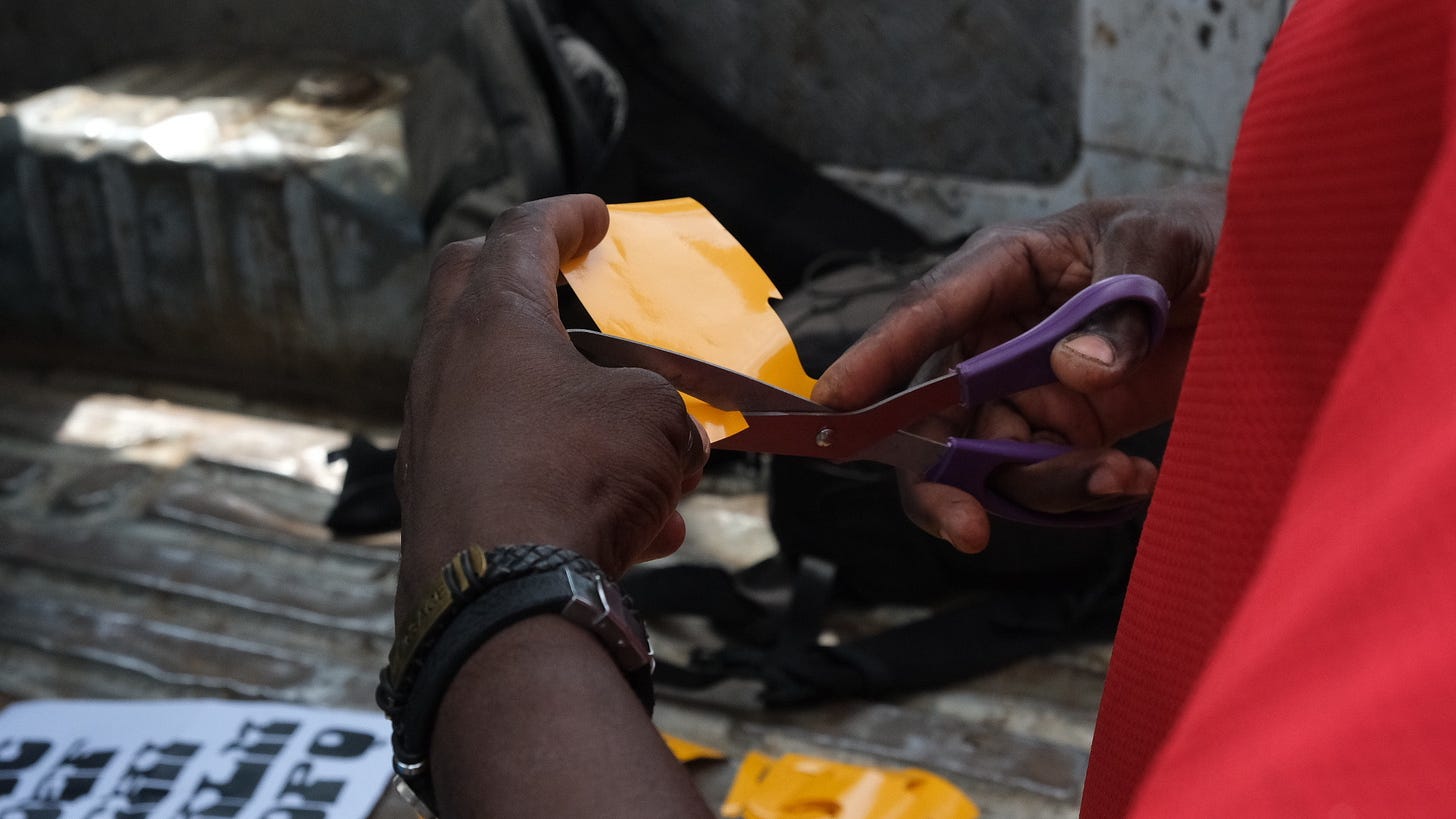
He notes that they were trying to cover a lot of scope. “We were supposed to make over a thousand glyphs per typeface,” he says. And as they got deeper into the project, they had to bring in a lettering artist. “We worked with Abu, a lettering artist to learn in real time how these stickers were made. Engaging him gave us several design breakthroughs,” he shares.
Working on two typefaces in 5 months is a ridiculous amount of work, he tells The Creatives Note. “It was a crazy crash course into type design that turned us into type soldiers,” he says. “My plan was to not work and just chill for a year after the studio was closed but I was thrusted into the world of type design after a short break.”
Read Also: Osun State faces public backlash for new logo; what is the outrage about?
Taking inspiration from culture and history
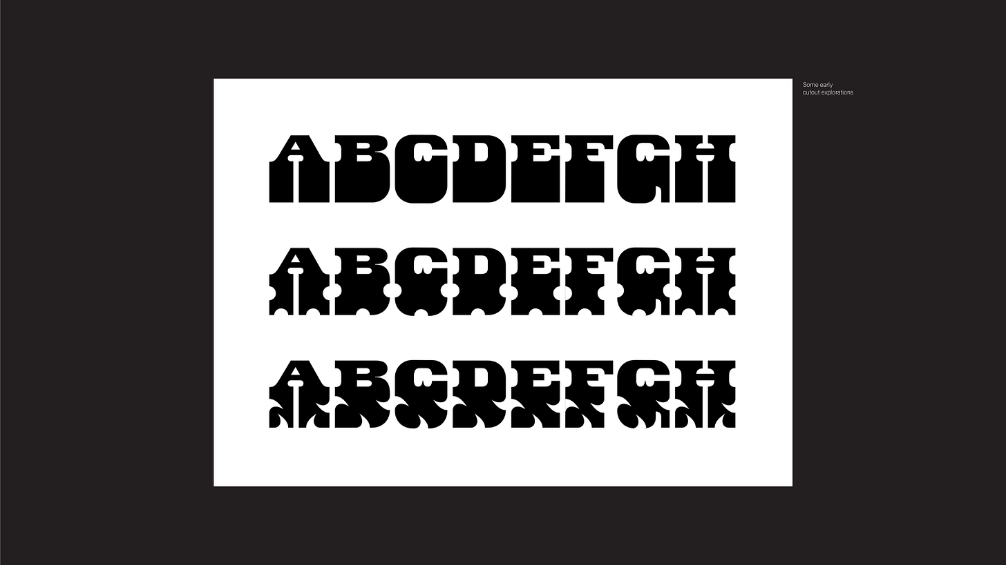
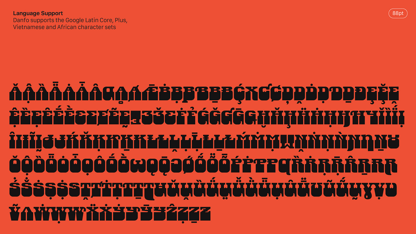
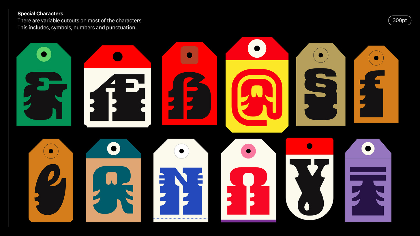
The Danfo typeface—which is an improvement of Danfo Std designed by Seyi in 2018—draws inspiration from the vinyl stickers on the iconic 'Danfo' buses of Lagos, Nigeria. “For Danfo, a Tuscan serif font, we had to be ethical about it. This is why we hired Abu and give him credit whenever we write or speak about the research process. It was tricky to standardise the letterforms while keeping very important cultural details in the DNA of the look and feel,” Seyi explains.
Danfo now features numbers, punctuation, symbols and language support for over 900 languages.

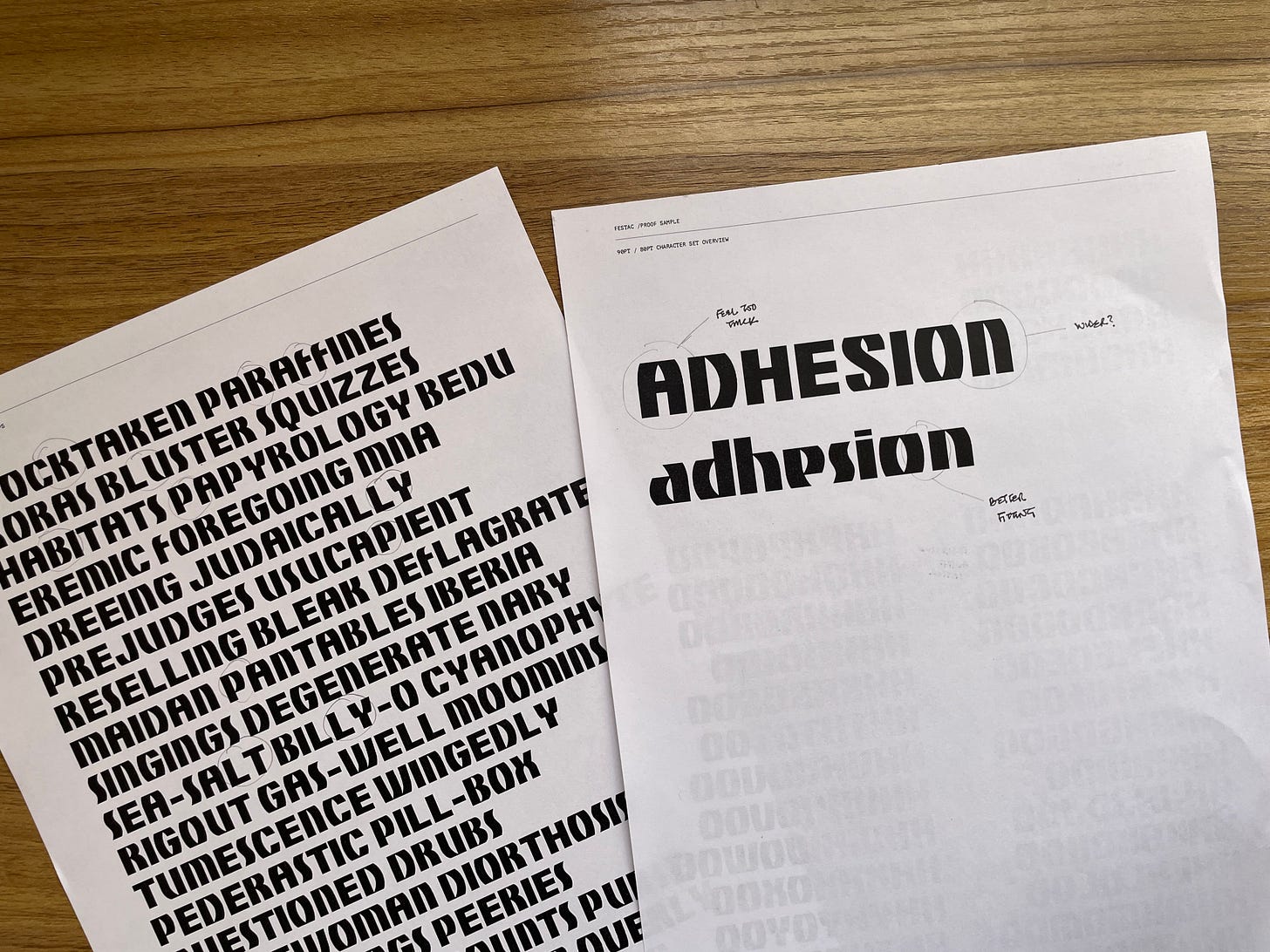
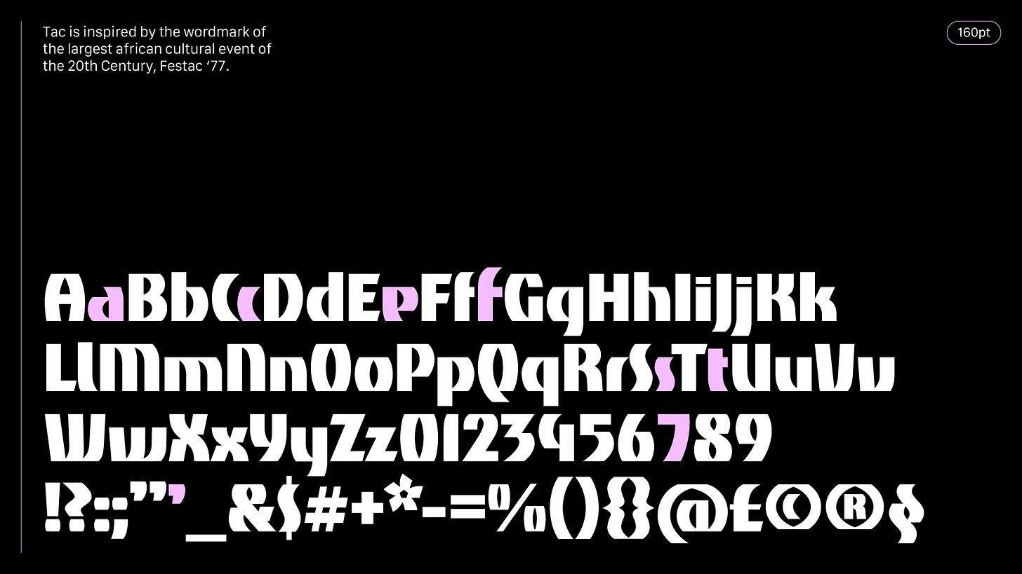
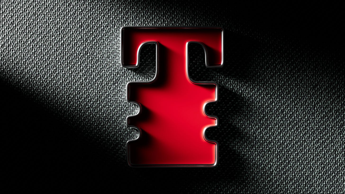
Tac—the second typeface the trio worked on—is a single-weight, bold san-serif inspired by the wordmark of Festac '77, one of the most significant festivals in Africa's post-colonial history. The festival, which was created to amplify black and African culture globally, empower black and African artists worldwide, and support cultural reconnection to Africa, was a very ambitious endeavour which had more than 15,000 participants from about 55 countries worldwide.
“Most of the explorations with Tac and Danfo I have seen look very mature. Something about using them commands having a good knowledge of graphic design.”
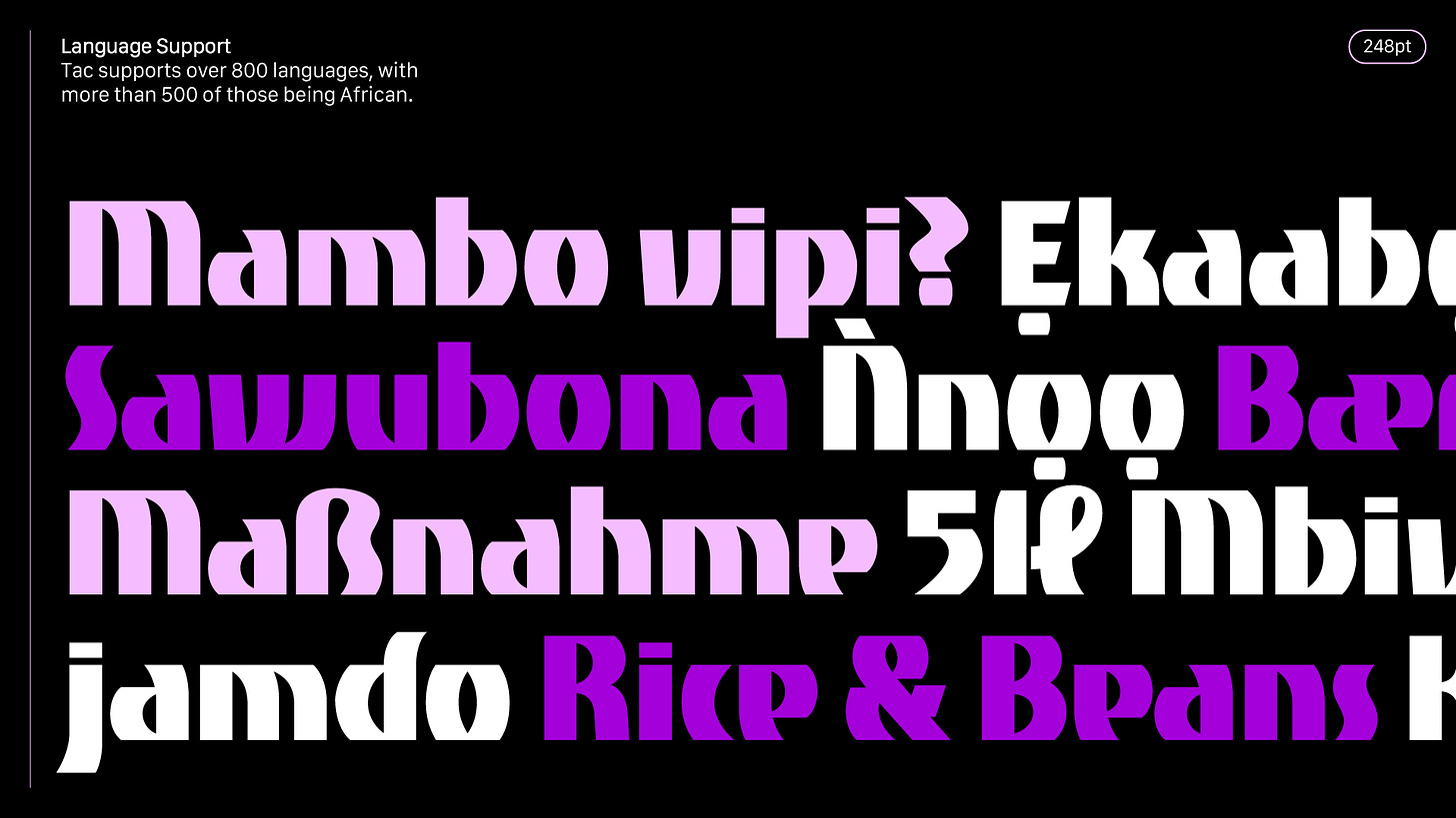
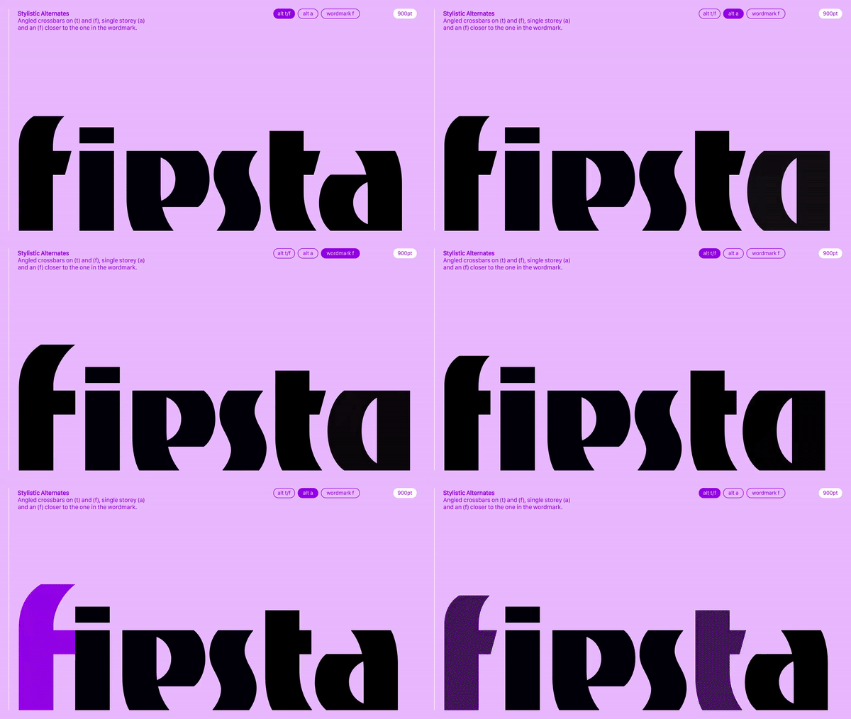
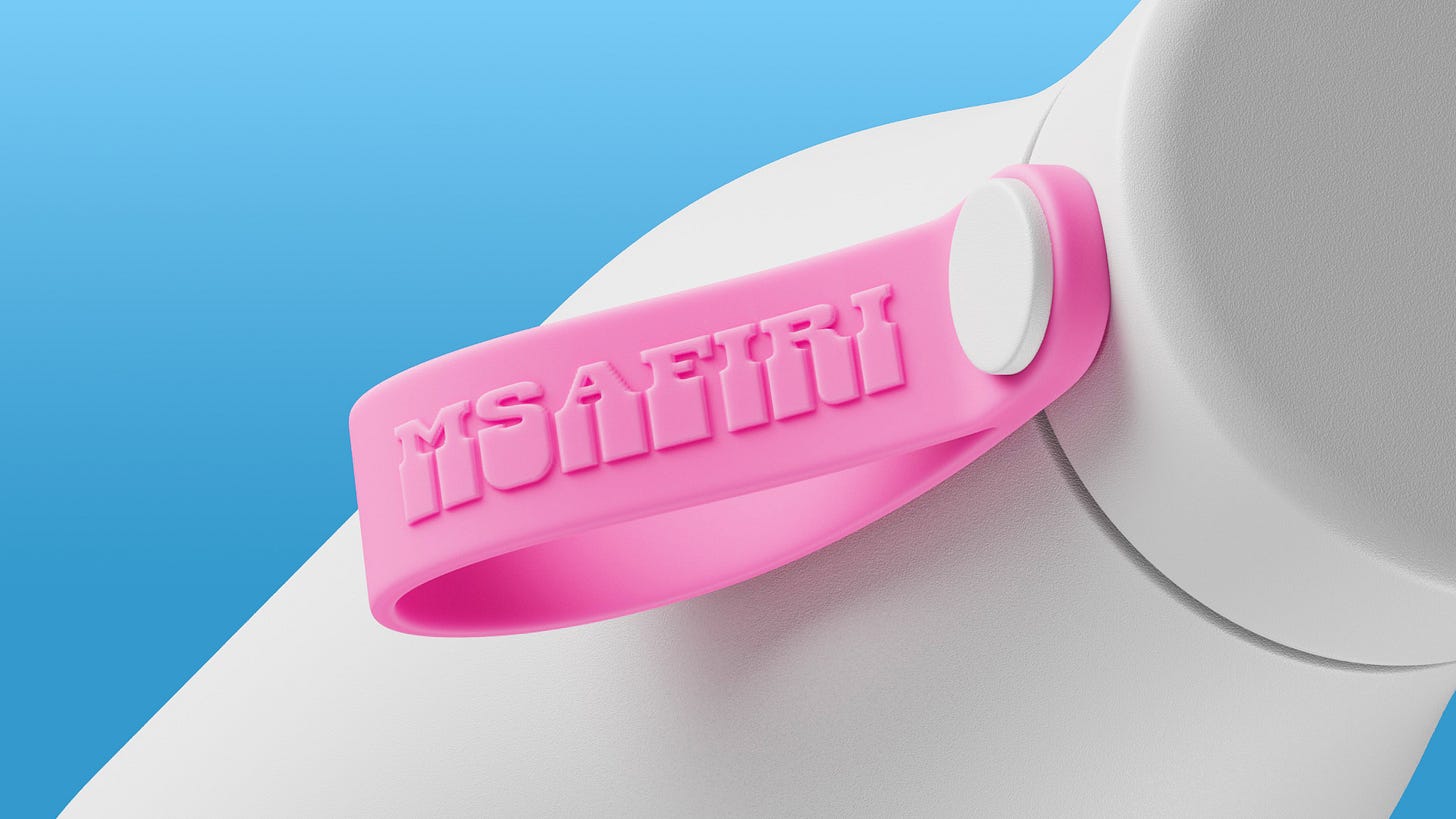
Tac, a revival of the Festac 77 identity, expands upon the six lowercase letters, single quotes, and number 7 in the wordmark, resulting in a complete Google SSA character set of over 1100 glyphs.
Public reactions and feedback
“The responses have been absolutely great,” says Seyi. “Seeing designers use the typeface to express themselves is the biggest joy for me.”
“The plan is to have tens of typefaces inspired by our history and contemporary culture that creatives all around the world can use and be rest assured is truly African.”
Also, the quality of people and work that the typefaces have been used for is fulfilling to see, Seyi tells The Creatives Note. “Most of the explorations with Tac and Danfo I have seen look very mature,” he says, adding that “something about the design of the letterforms makes designers acutely aware of design principles and I love that.”
As for feedback, he mentions that the reaction has been two-fold. On one hand, Tac has helped to educate people about Festac 77. “When people come across the typeface, they go and research about it [Festac 77],” he explains.
Festac 77 was a very significant event, says Seyi. “It was bigger than Nigeria. It was an event for Africans and Africans in the diaspora. People from all over the world came,” he notes. “It was very symbolic in the sense that it was a glimpse into what a working Nigeria would look like. The houses in Festac, which accommodated over 15,000 people, had light, food, water and transportation.”
He adds, “It was a huge feat. And the more I read about it, the crazier it is to me that nobody talks about it.”
While he notes that there are different schools of thought on the importance, impact, and cost of the festival, he says, “The fact is that it happened and people from around the world came.”
The reception from the designers, creatives and people who partook in the festival has been amazing, he tells The Creatives Note. “Marilyn Nance, the photographer in charge of covering the participation of the North American contingents in Festac 77, reached out when Tac dropped,” Seyi shares.
Ms Marilyn, whose images are currently in the Museum of Modern Art (MoMA), has gotten a lot of acclaim for her work. “She has been pushing Tac since it dropped, and it has been incredibly satisfying to see because she understands the significance of the work and is willing to associate with it,” he adds.
On the other hand, Tac and Danfo are now an option for creatives to use when they need African-inspired typefaces. “Currently, the world is consuming the work of a lot of African creatives across art, design, architecture, music and film,” he says. “And it amazing to be able to create typefaces that are representative of our culture and history.”
What Next?
Now that Tac and Danfo are live, Seyi hopes for more collaboration with Google Fonts. “The platform they have is incredible,” he says. “And we hope to drop a newer and refined version of the typefaces with more weights.”
Apart from that, he plans to make more typefaces. “We currently have one in the works called Lagos Island Slab, inspired by the very dense architecture in Lagos Island,” he reveals. “Though, it’s still in the very early stages.”
But in the long run, the plan, according to Seyi, “is to have tens of typefaces inspired by our history and contemporary culture that creatives all around the world can use and be rest assured is truly African.”
Check out Danfo on Google Fonts. Also, check out the Tac One typeface on Google Fonts.
Do you have a story, project, tip, news, opinion piece, idea or event you want to feature on The Creatives Note? Reach out to us via thecreativesnote[at]gmail[dot]com.


