Vome Studio's identity revamp for Bentsi-Enchill modernises its visual identity without compromising its esteemed 20-year legacy
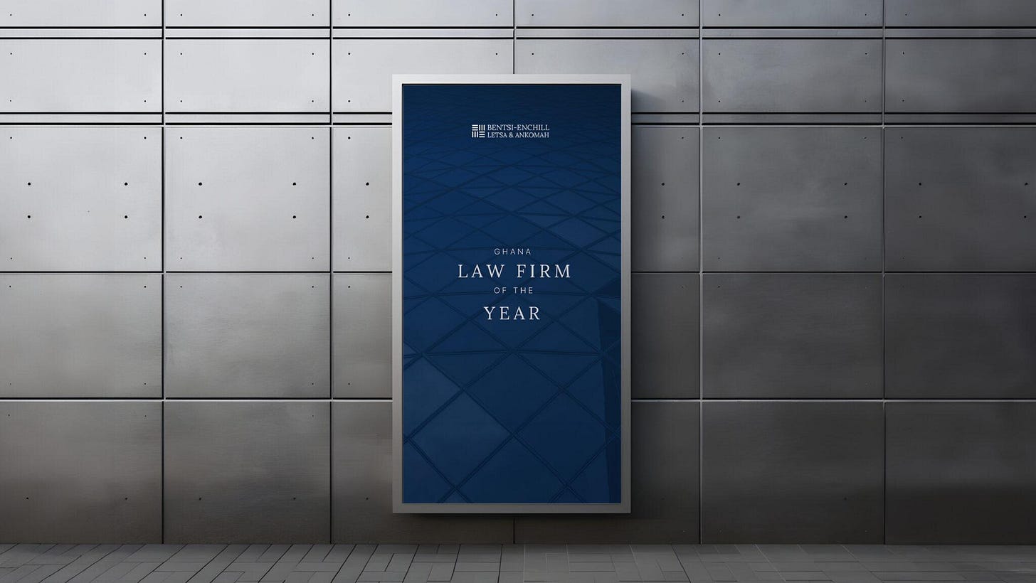
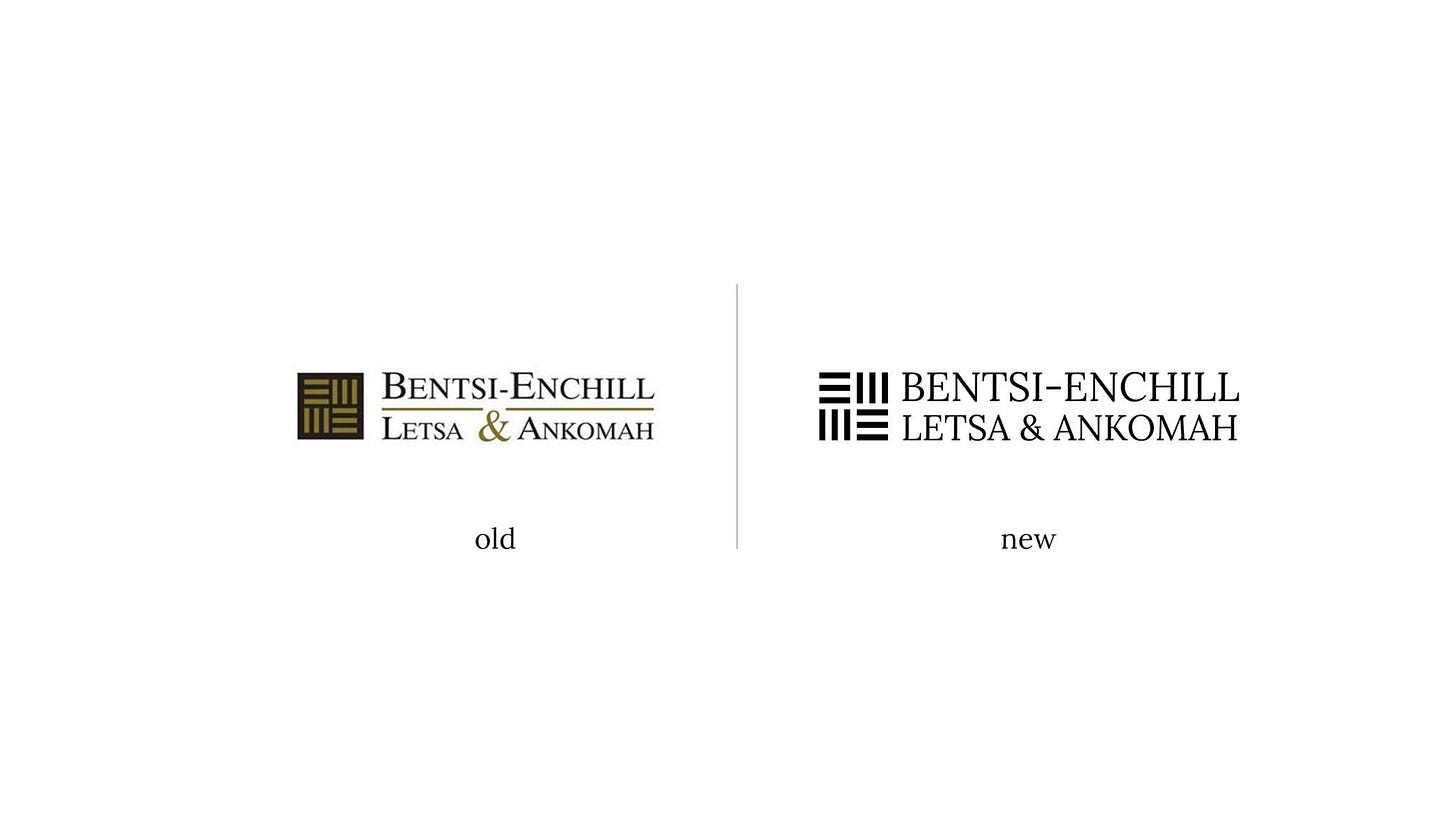
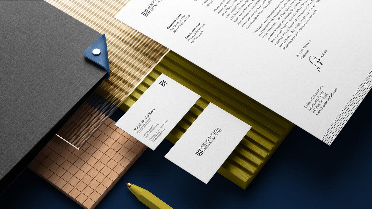
Rather than a complete overhaul of the identity, Vome studio chose a nuanced redesign approach, making the logo more accessible and subtly refined. The new logo is an evolution of the original logo
Ghanaian brand studio Vome Studio recently revealed its identity revamp for Bentsi-Enchill, Letsa & Ankoma (BELA), a premier law firm in Ghana that has been in existence for 20+ years.
Founded in 1990 with the mission to provide its clients with excellent market-leading legal services, Bentsi-Enchill, Letsa & Ankomah has built its reputation working on the most complex transactions and disputes for foreign investors, local companies, statutory entities and the government in Ghana.
For this project, Vome Studio set out to “modernise the firm’s visual identity to align with contemporary branding standards without compromising its esteemed 20-year legacy.”
“They came to us with a deliverable list of what they wanted. They wanted some visual design work done and like many clients, they came with the tangible things they wanted to get from the project because it is easy to cost for those things,” Joshua Cleopas, founder and creative lead at Vome Studio, tells The Creatives Note.
“But on looking at the brand, we found out that there was a more deep-rooted issue: they didn't have a brand or visual identity that ties to the reputation they have built for themselves in the past 20 years.”
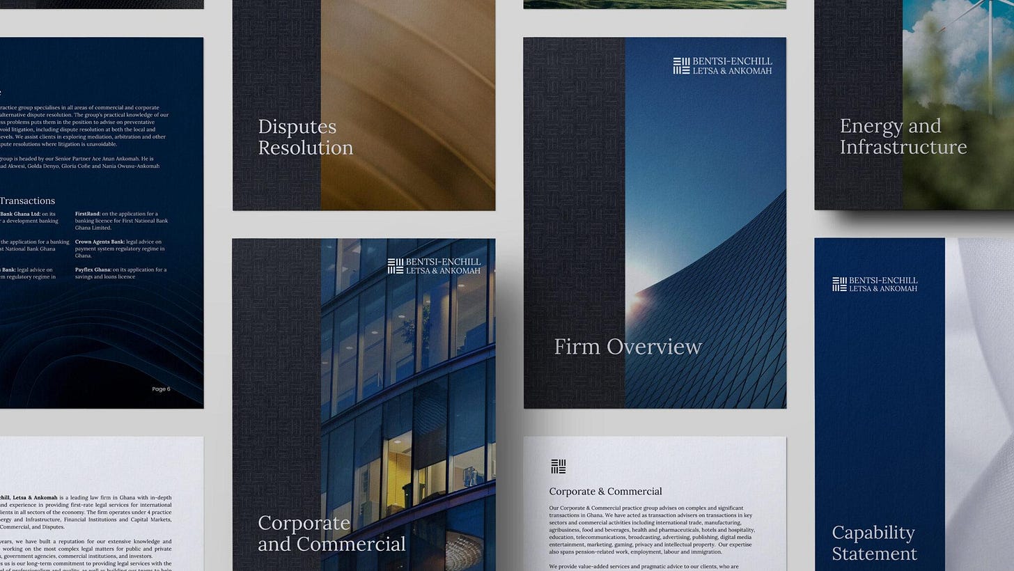
While the firm had a logo, it didn’t have a brand system that guided how it spoke or looked. “They only had a logo they were recognised with. They didn't have any system that dictated how they should approach their tone of voice or a system that dictated how they think about their entire look and documentation,” he says.
“As a law firm, they work with a lot of documents and everything looked different. For example, the look of a presentation document depends on the person preparing the document. The only thing that tied these documents together was the logo—which, in this case, served as a stamp.”
They didn’t realise this because they were so good at what they do as a law firm that their brand identity lived off the reputation of the company itself, Cleopas notes.
“After reviewing this, we noted that there was a disconnect between how they were on the ground and how people saw them online,” he explains. “So we told them we needed to move a step back and fortunately for us, the person interfacing with us on the project was a very open-minded person.”
With this new information, they pitched a comprehensive brand revamp to the stakeholders, who were receptive to the idea. “We had to approach it with care because of the legacy the firm had built. We had to maintain a connection with their existing icon, so we didn’t change everything entirely.”
The New Identity
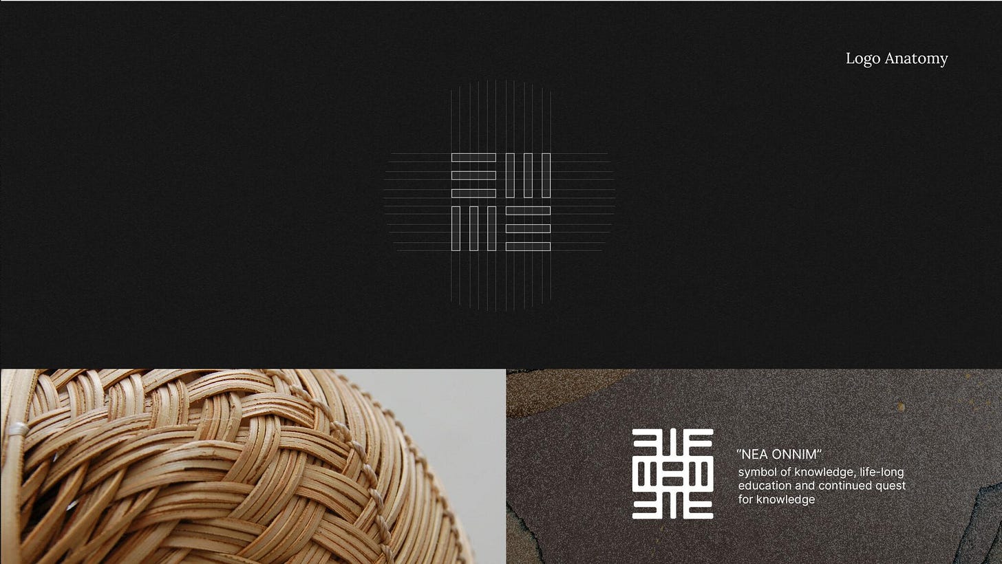
Rather than a complete overhaul, Cleopas mentions that they chose a nuanced redesign approach. “For the project, we decided to improve the original logo, which was inspired by the ‘Nea Onnim’ Adinkra symbol representing knowledge and wisdom,” he says.
“We simplified the icon and made it optically correct. We also took away the box to reflect their openness and forward-thinking approach.”
Read Also: AFCON 2023 Identity: A Beautiful Story of Strength and Unity through Football
The logotype was also improved. “One of the things we changed was the logotype and the way the name was written. In the old logo, the first character of each name was bigger. Also, Bentsi-Enchill was underlined and emphasised and it didn’t look like Letsa and Ankomah were equal partners. We removed the line and made the characters uniform to make everything look like a single unit,” he explains.
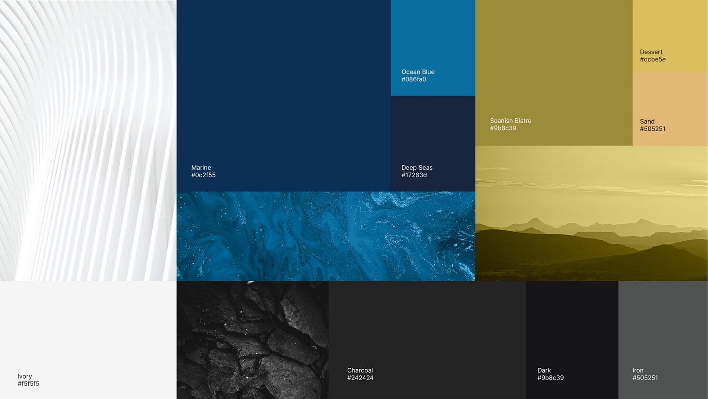
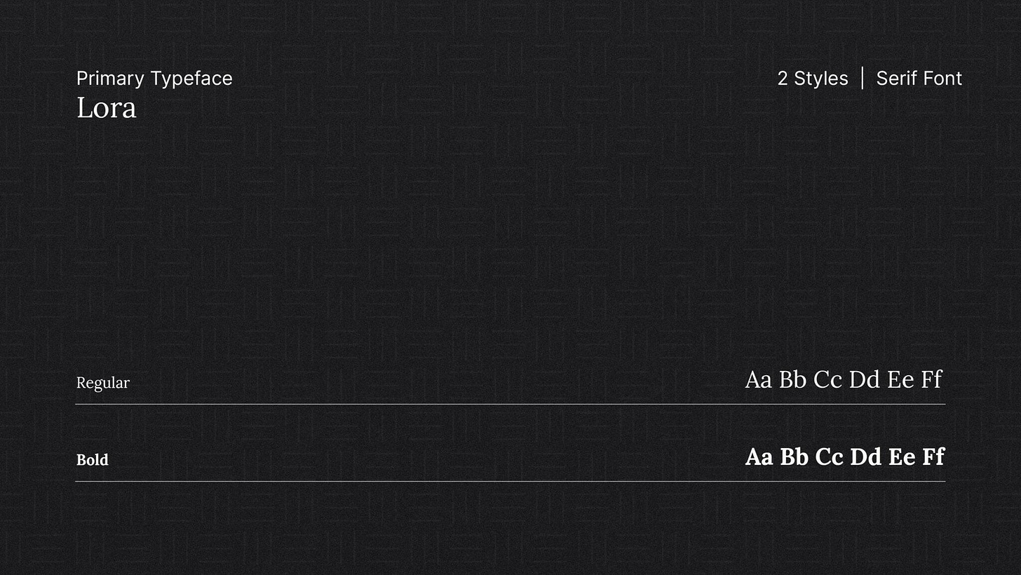
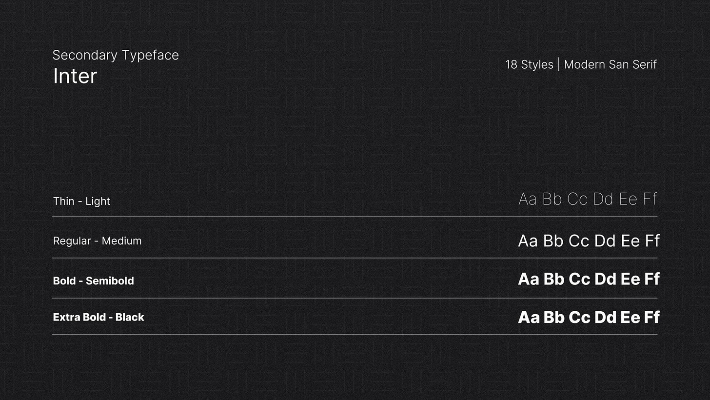
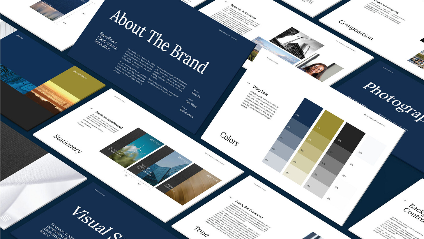
“We also improved the colours and selected Lora and Inter as the brand typefaces.”
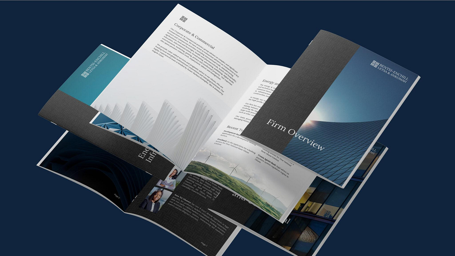
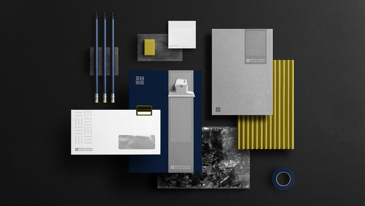
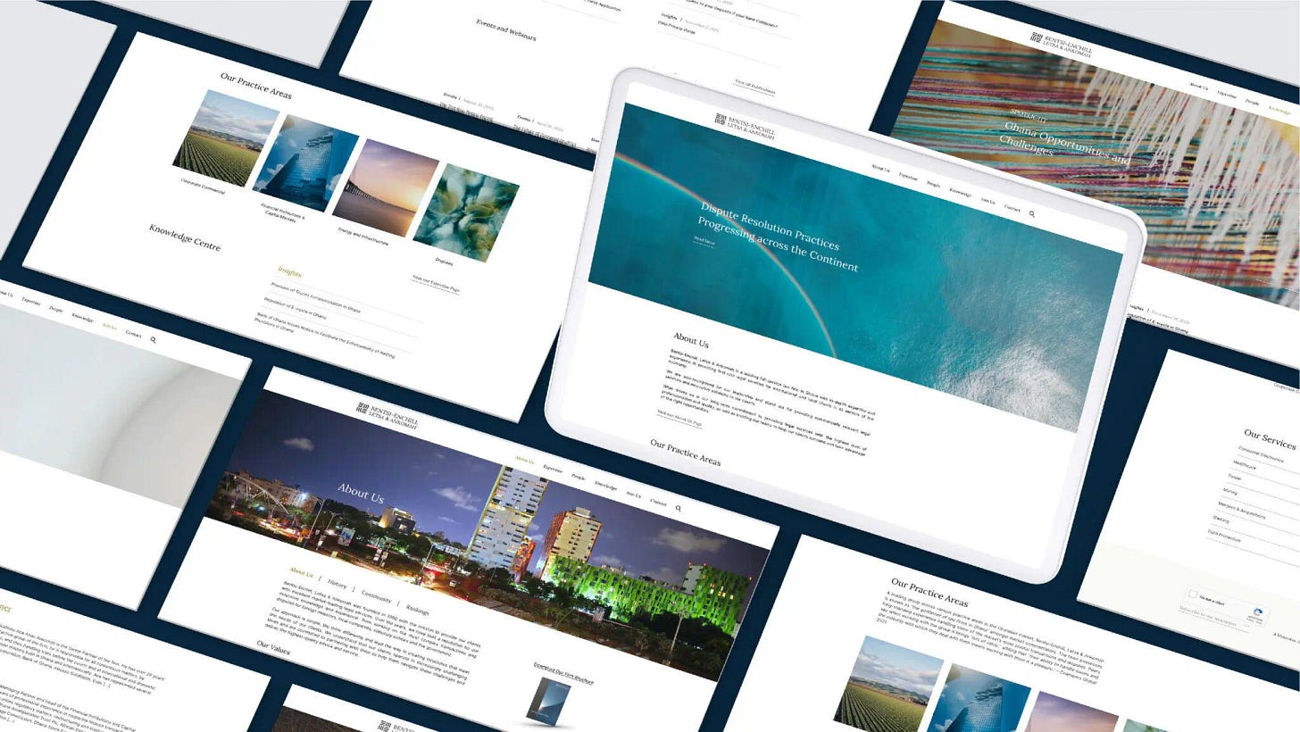
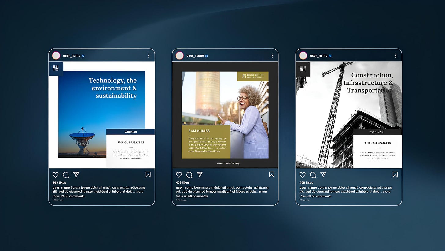
They loved the new direction, says Cleopas. “Once the new identity was approved, we extended it to their website and other brand collaterals—creating an identity system and a very extensive style guide,” he shares. “We also created Canva templates and trained the in-house team how to use the templates.”
While the project itself took about two months, Cleopas notes that they have continued to advise and occasionally work with the team when needed to extend the identity expression. “I was invited to the in-house launch of the identity and the feedback was great,” he shares.
The success of this project, Cleopas says, rests on the strength of the collaboration between both teams, and the experience with this project underscores the significance of this relationship. “This collaboration was seamless and actively championed by Abigail Nikoi, the Head of Business Development and Marketing, and her Assistant Kate Oklu,” he tells The Creatives Note.
“Their proactive approach made the project seamless and served as a bridge between our team and theirs, greatly expediting project completion.”
Designers need to prioritise collaboration and communication, as they are indispensable ingredients for every design project's success, Cleopas adds.
“After launching the new identity about two years ago, a lot of law firms in the country also went to do a ‘rebrand’. It’s been interesting to see.”












Love the pragmatism and restraint!